

Any successful website is a product of high quality content, powerful web design and solid SEO. All these aspects play a very important role in developing a high ranking and attractive site. This puts a responsibility on web designers when building an entire website and its online presence to understand at least the basics of SEO, which they can implement into their web design approach. In this blog, we discuss the basic applications of SEO for web design that everyone should know when building or updating a website.
Site Structure
Your website structure determines how your audience navigates throughout the different levels of your site and there is always multiple ways for information to flow to a certain path. When web design comes into play, it’s crucial to understand that if the visitors are having issues navigating through the website or struggling to achieve their intended destination, the sites overall traffic will always be affected.

It doesn’t matter whether the visitor is new or experienced, the structure of the site should boast a causal flow of navigation with a well-thought out hierarchy. A standard rule across most websites is that all pages should be no more than four clicks away from the homepage. On top of this, when page URLs are created, make sure to follow a URL structure that includes the multiple levels of each page if applicable, such as:
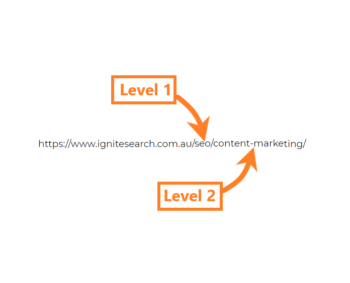
Users aren’t the only ones accessing your website, there will also be search engines looking to crawl your site and determine your ranking based on the ability to access content. So it’s important to keep in mind an easy flowing design for both users and search engines as this will dramatically support your SEO efforts, allowing both to find any piece of content in the quickest way possible.
Image Optimisation
Images are one of the most important aspects in creating an aesthetically pleasing website and its generally the responsibility of web designers to implement imagery across a site. When it comes to images and SEO, there are many factors that can influence your rankings. Therefore, it’s a good idea to have an understanding of how image optimisation works for SEO and the best practices you can apply when designing the imagery of a site.
The first thing you want to ensure is the right size and resolution, as large images can heavily slow down your web pages, hurting user experience and eventually search rankings. It’s essentially about finding the right balance between both size and resolution, ensuring that all the images remain consistent throughout the page. If you’re original image is too large, simply resize the image or use an external program to compress the file size to something smaller.
Once the images have been uploaded, you want to make sure you fill out its alternative text. This attribute won’t be visible to your generic visitor, but this provides a description of your image for search engines to read, so they can determine its relevance. A good ‘Alt Text’ consists of a short phrase that explains what the image is showing and contains one or more targeted keywords. However, avoid ‘keyword stuffing’, as google has officially stated:

“When choosing alt text, focus on creating useful, information-rich content that uses keywords appropriately and is in context of the content of the page. Avoid filling alt attributes with keywords (keyword stuffing) as it results in a negative user experience and may cause your site to be seen as spam.”
Mobile-Friendly
In 2015, Google announced that mobile searches have surpassed desktop searches and 2 years later, they introduced us to mobile-first indexing. Google has evidently made it clear that optimising for mobile is becoming more important by the day and that any website optimised for desktop needs equal consideration for mobile as mobile-friendliness has become a confirmed ranking factor. To create a true mobile-friendly design and maximise mobile traffic, you must differentiate the needs between a desktop user and a mobile user.
Google offers a variety of tools for testing mobile usability, one of the more popular tools is the Google Search Console, as it offers a full usability report that details issues on a page-by-page level. This should be consistently utilised whilst the website is being developed to keep on top of mobile optimisation.
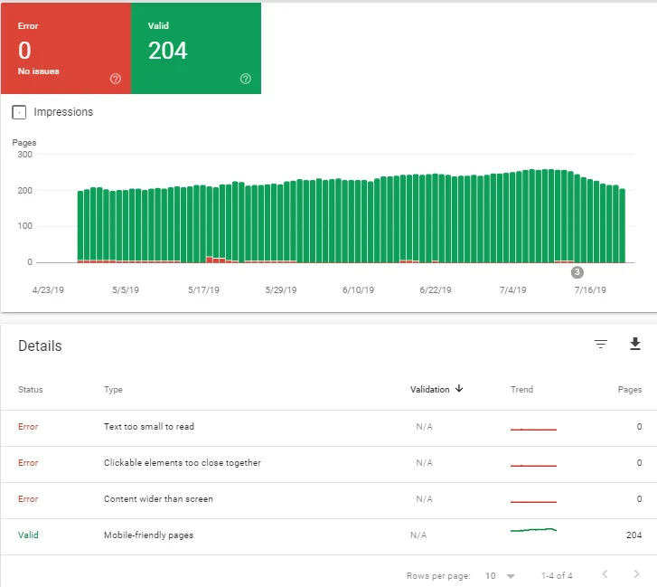
Here are some factors to look out for when it comes to mobile web design and SEO:
- Touch Elements: If certain elements are too close, users may run into the issue of tapping the desired element without hitting its neighboring element.
- Flash: The majority of mobile browsers do not render Flash, it is therefore recommended to avoid this where possible.
- Viewport & Content: Sometimes page content may not fit the window and a user is forced to scroll. Ensure you keep on top of the widths of pages on mobile.
- Font Size: The font size might look fine on a desktop, but this can scale differently on mobile and could potentially be too small to read.
- Interstitial Usage: If you have an automated pop-up, this can pose many mobile problems if the user is unable to close it, affecting user experience and accessibility to the site itself.
On-Page Content
It’s one thing attracting visitors to your website, but you also have to be able to “close a sale” for that successful end result. The on-page content is going to be the main contributing factor when it comes to converting those visitors and it’s crucial in the way it’s designed to help you do something with the high-quality traffic you’re receiving.
A well-designed, SEO friendly page should easily guide a visitor through the site to their desired location such as a product page or an appointment form. Micro-conversions are also important; these help build on how invested visitors will be into their website experience. Here are some on-page elements for micro-conversions:
- Clickable links
- Newsletter signup
- Watching a video
- Lightbox popup

Even if a conversion does not take place at the time, the visitor can learn more about your brand and be more compelled towards a future conversion. Furthermore, search engines can ‘track’ these interactions and see how many users are clicking on these and how long they are staying on the site for, which is considered a positive user experience.
On top of conversion rate optimisation (CRO), there are many other on-page content practices that benefit SEO. The biggest focus is on creating engaging content that initially attracts visitors. Incorporate appropriate headers and sufficient keywords, but limit the keyword density as it can make for a poor user experience. Here are some practices for on-page content:
- Structure & flow of written content
- Primary keyword positioning (above the fold)
- Internal linking
- Synonyms & alternatives to the already present keywords
Whilst you’re designing on-page content, you also want to be aware of how heading tags are used. A higher value is placed on these tags in relation to other on-page text, as these provide search engines with information on the structure of your HTML document. The h1 tags should be the primary topic of the page, with h2 through to h6 indicating the rest of the content hierarchy. It’s also generally considered good practice to not use multiple h1 tags so that your primary topic is not diluted.
Conclusion
Website SEO and design are both major contributors towards the success of a website. Therefore, it should be the standard for any web designer to equip themselves with the knowledge of the primary SEO elements that should be considered during the design phase of a website.


