
Logos are some of the most iconic symbols for many brands across the world. They can uniquely communicate your brand’s personality, values and core messages at a glance. They make the first impression. And like most things in life, looks do indeed matter. This first impression can mould how the viewer thinks about your brand from that point forward. Logos also serve as the cornerstone for your visual branding—such as your website and business card. Some logos include: wordmarks (or logotypes), mascot logos, and emblems. In this blog post, we are going to look at 6 design tips to follow to make sure your logo stands out amongst the crowd.
Choose The Right Colour Palette
The colour palette you choose for your brand can often decide whether your logo leaps off the page or falls flat. But, how do you know which colours work well in a logo design? A great rule of thumb is to opt for either an analogous or complementary colour scheme.
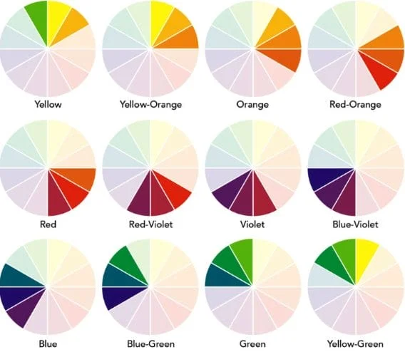
An analogous colour palette is when you use 2 colours that sit near or next to each other on the colour wheel. An example of this would be yellow and green (a great example of this is Subway) or purple and red (like the firefox browser logo). When these colours are paired together, it creates a harmonious feel that is pleasing to the eye. This colour pairing is ideal for brands that want their logo to feel relaxing and grounding.
On the flip side, you can choose a contrasting colour palette. This works really well when you want to make your logo pop. Complementary colours are when two colours sit opposite of each other on the colour wheel. This creates high contrast in your logo design for a visually-arresting effect that borders on jarring. This makes it nearly impossible for the viewer not to pay attention to your logo!
Have Readable Typography
Your logo can be stunning, but if the viewer isn’t able to read your text, it’s not going to leave a lasting impression (it might actually leave a bad impression). It is paramount you use readable and web-friendly fonts to have your logo look polished and proper. A good example where type face matters is in your shop front window. If your name is not readable from the street by commuters passing by, the logo has failed. Classic example of typography chosen well are; the coca-cola logo, it is nostalgic and evokes memories of the past, in comparison the Apple logo in it’s simplicity evoke modernism and simplicity.
A great option for a logo is a bold medium to heavy weighted, sans-serif font as thin fonts tend to not be readable from afar. Logo fonts need to stand out and get your point across instantly. Other great choices are geometric League Spartan, the classic Monsterrat and the more feminine Playfair Design.

Make Sure Your Elements Are Aligned And Balanced
Ensuring meticulous attention to the kerning and tracking of your logo is a critical aspect that can elevate it from a mere 5 to a stellar 10. The significance lies in the careful consideration of every detail, including letter and word spacing, as well as the alignment of visual elements and margins. By meticulously refining these elements, you create a visual composition that not only exudes professionalism but also fosters a sense of balance and harmony within your logo. This deliberate approach to spacing and alignment contributes to a cohesive and well-integrated design, ultimately leaving a lasting and positive impression on your audience. Therefore, when refining your logo, remember that the devil is in the details, and the thoughtful precision applied to these elements can make a substantial difference in the overall impact and perception of your brand identity.
We advise to follow the rule of 3, viewing the logo as the size of a grape, and apple and a watermelon (or larger). If the logo is well balanced and the elements are aligned the logo should look exactly the same in every size and be pleasing to the eye.
Create A Visual Path That Makes Sense
A great designer will know how to take their viewers on a visual journey through their logo. When people look at your logo, they usually won’t scan it from top to bottom. What they do instead is they look at the most prominent area first. So, think about what piece of information you want them to look at first, then structure your logo accordingly. You can do this by simply making it the largest or boldest element on the page. From there, viewers will normally look for visual cues that direct them to the next most important piece of information—whether that’s through arrows, framing or visual contrast
Adhere To Relevant Design Principles
When crafting a logo, it’s crucial to adhere to fundamental design principles that streamline the creative process. These principles serve as the bedrock for diverse logo types. Balance emphasises achieving a harmonious and polished appearance by ensuring elements are not disproportionately shifted, maintaining visual equilibrium.
Repetition strategically guides the viewer’s eye through the design, employing subtle variations to avoid monotony. Contrast introduces excitement by juxtaposing opposing elements, creating a ‘wow’ factor. Dominance involves making a focal point more prominent, injecting dynamism while carefully balancing with other elements.
Lastly, the principle of hierarchy organises information logically within the logo, facilitated by framing, typography, and colour, along with the other design principles. Together, these principles provide a comprehensive framework for crafting visually appealing logos that effectively convey essential brand information.
As a principle rule, a logo for your brand should be sexy, suitable and sustainable. This is where the logo is appealing to your audience, is suitable for your industry and service offering, as well as sustainable, able to be used in many different colours, and for different elements of your business. As your business grows, your look and feel will also change, so remember to leave growing room for your logo to change and update with you.
Logos serve as powerful symbols that swiftly communicate a brand’s essence. As the cornerstone of visual branding, a well-crafted logo leaves a lasting impression, shaping how viewers perceive the brand. To stand out in the crowded landscape, adhere to key design tips: choose the right colour palette for emotional impact, ensure readable typography, maintain meticulous alignment, create a logical visual path, and follow essential design principles like balance, repetition, contrast, dominance, and hierarchy. By integrating these tips and principles, your logo will not only capture attention but effectively convey your visual identity to a broad audience.