
Painting The Colour Theory For Marketing
In the vibrant world of digital marketing, understanding the psychology of colours is not just an art; it’s a strategic science that brands leverage to connect with their audience on a deeper level and enhance their branding. This blog post delves into how different hues are used in branding and social media campaigns to evoke specific emotions and actions, so you can take your branding to the next level.
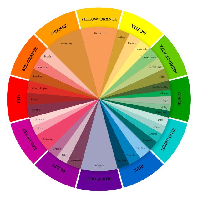
Red: The Color of Energy and Urgency
Red, known for its vibrancy and intensity, is a colour that compels action. It’s no coincidence that many brands use red in their ‘Limited Time Offers’ to instigate urgency
and prompt immediate response.
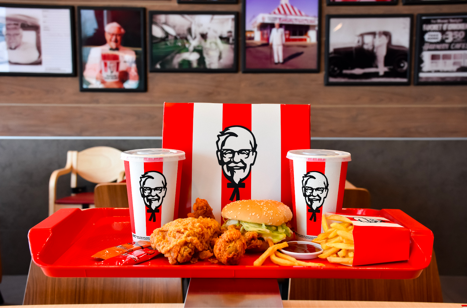
But the influence of red goes beyond just urgency; it also stimulates appetite. This is why fast food giants like McDonald’s, KFC, and Hungry Jack’s prominently feature red in their logos and branding. The red colour not only grabs attention but also subtly encourages cravings (there’s also another colour that does this, read on to find out).
Orange: Enthusiasm and Creativity
Orange combines the energy of red and the happiness of yellow. It’s associated with enthusiasm, creativity, and warmth (think of the Ignite Search fire symbol as an example). It’s often used to attract a youthful and energetic audience and can often be associated with having a fun and innovative spirit.
Green: Symbolizing Health and Tranquility
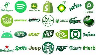
Green, the colour of nature, is synonymous with health, tranquillity, and sustainability. Brands that focus on wellness and environmental friendliness often adopt green in their branding. Starbucks, with its iconic green logo, exemplifies this by promoting a sense of relaxation and connection to nature. Tic Tac and Heineken use green to highlight their commitment to freshness and natural ingredients, aligning with a more health-conscious consumer base.
Purple: Luxury and Wisdom
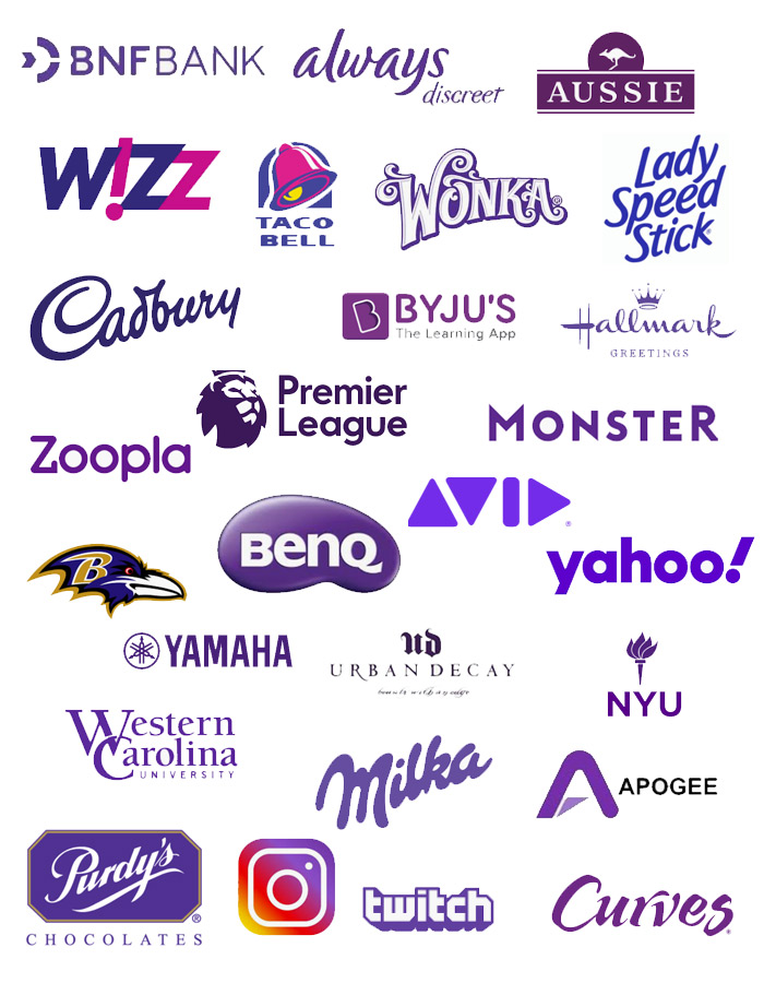
Purple is traditionally associated with royalty, luxury, and wisdom. It’s often used by brands to give a sense of quality and premium status. A great example of this is Cadbury. They use a rich purple in its branding to convey a sense of indulgence and luxury in its chocolates. Similarly, Yahoo and Twitch use purple to stand out and suggest creativity and originality.
Blue: Trust and Dependability
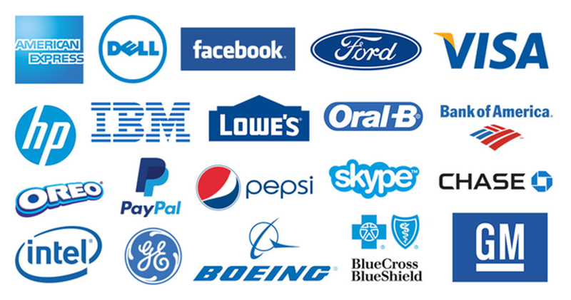
Blue, a colour that exudes trust and reliability, is a favourite among banks and technology companies. For example, ANZ Bank utilizes blue in its logo to reinforce its dependability and stability as a financial institution. In the realm of social media, platforms like Facebook (prior to its rebrand of Meta) and Twitter (prior to its rebrand of X) have traditionally used blue, suggesting a sense of calm and reliability, and encouraging users to trust and spend time on these platforms.
Yellow: Radiating Happiness and Optimism
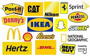
Yellow, the epitome of joy and energy, is strategically used by brands that want to project an image of fun and optimism. Reese’s, Chupa Chups, and Snapchat are excellent examples of brands employing yellow to convey a sense of playfulness and positivity. This colour not only captures attention but also leaves a memorable impression of cheerfulness associated with the brand. It is also heavily associated with fast food. Think of the giant ‘M’ arches of McDonalds.
Black: Elegance and Sophistication
Black is powerful and sophisticated. It’s often used in luxury product marketing, like with luxury cars (think Mercedes-Benz) or high-fashion brands (like Chanel). Black can create a perception of elegance, sophistication, and exclusivity.

The Art of Mixing and Matching
The strategic use of colours in branding and social media isn’t limited to single hues. The real magic happens when these colours are mixed and matched to create a spectrum of emotional and psychological impacts. By understanding how different colours interact and complement each other, marketers can craft more nuanced and
effective branding strategies. At Ignite Search, We use colour and other marketing psychology tools to their fullest potential. If you need more guidance, feel free to download our free branding worksheet, read our blog for more inspiration, or contact us for a consultation.