Anyone who runs their own business, or who has a liking for a particular brand, will know how important a logo is to a company or organisation’s identity. And keen logo watchers will also have noticed that there has been a shift in logo design trends in the last couple of years.
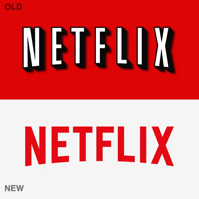
In essence, logo design has become simpler and cleaner. A decade ago, elaborate 3D logos were generally being used by both global and local brands, featuring complex colour blends, intricate images and irregular shapes.
In 2022, however, flat logos are being favoured by both brands and UI UX design agency professionals alike, with flat logos now being the most common way in which organisations showcase their brand and values.
How do flat, minimal logos enhance brand identity?
There is no doubt that flat, minimal logo styles are highly effective at conveying brand identity.
When it comes to UI UX design services, for instance, a flat logo means you can use the same design across all media and platforms. This versatility means the same logo, and its icon and colour palette, can be utilised in any form of marketing collateral, including printed materials.
Using a single color as the background in a logo rather than multiple shades or hues also makes it easier for a brand’s identity to be instantly recognised — consider, for instance, your favourite brand, app or platform, and a bold primary colour will also likely come to mind (think Twitter, think Facebook, think Tik Tok as examples).
3 possible theories for this movement
As well as the practical benefits outlined above, there are some more elaborate theories underlying why logo design has changed direction in recent years.
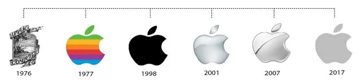
The iOS 7 Theory
When in 2013 you updated your iOS iPhone or iPad, a change was immediately apparent. App logos had been redesigned in a flat style, with the previous glossy, textured icons being binned. Although no particular UI UX agency claimed credit for this change, it was destined to become a far more revolutionary act than anyone could have imagined.
As is so often the case, what Apple does first the rest of the world follows, and soon app icons across the board took on the new flat look, and it’s hard to see Apple or anyone else rowing back from this anytime soon.
The Design Flexibility Theory
Although the use of colour is crucial to a brand’s identity, at the same time a bold or subtle inversion of the regular palette can also be highly effective. Flat logos mean that they can be re-imagined for specific purposes in stark black & white, or inverted so that the icon and background colours are reversed. In this way, a logo can be adapted in an eye-catching way to suit a variety of different media.
The shock of seeing a logo in different colours can be a highly effective tool, and this is much more easily achieved with a flat design.
The Millennial Attention Span Theory
A slightly more ungenerous theory as to why flat logos are in vogue is that the way in which millennials use media means their attention is never in one place for too long, and so a more subtle, nuanced rendering of a logo simply isn’t going to get their attention.
This means that a UI UX agency tasked with designing a logo that is intended for millennials is almost always going to opt for a flat design as the most likely way of reaching the intended audience.
The keys to flat logo design
Although logo designs are many and varied, there are nevertheless some key principles that the best UI UX design services employ.
Geometric shapes, for instance, are highly effective, as their simple, clean lines can stand out against any sort of busy or crowded background, regardless of the media.
This also enables scalability, which is important in a multi-platform environment. Your logo needs to look good and be clearly understood as both a favicon and on a billboard, so your UI UX design agency should be aiming to make scaleability a key feature.
As discussed above, a single, bold, primary colour is a key part of the best flat logo designs. This is because it needs to be instantly recognisable, able to be used in print, digital and online media equally well, and also able to be inverted or subtly altered when you want to make a sudden impact.
For more information, contact us (+618) 9467 9883 or get a free quote today