





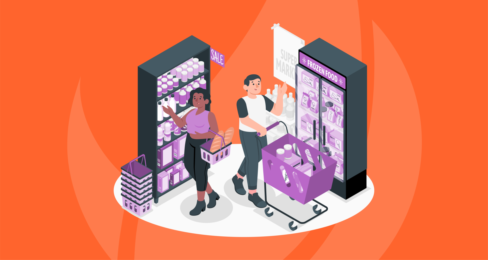
“Where have they put it now?” It is a sentence most of us have muttered while standing in a supermarket aisle that definitely contained that particular item last week. You came in for five familiar items, but one is now on clearance and another has moved and you are now wandering past unfamiliar products you had no intention of buying. At Ignite Search, we see this as an everyday example of retail marketing strategy at work. Where products sit, what customers pass along the way and how easily they move through a store can all influence what ends up in the trolley.
Stores do not rearrange everything purely to confuse people. Layout changes can reflect new product ranges, seasonal displays, renovations or attempts to make categories easier to shop according to changing customer preferences. Still, every change affects what customers notice. Here is why finding what you need is only one part of how a store is designed.
Your Shopping List Is Not the Only Plan
Most people enter a supermarket with some idea of what they need. Even without an itemised list, there is usually a loose plan: milk, bread, dinner and perhaps one emotional support snack.
The store has other ideas.
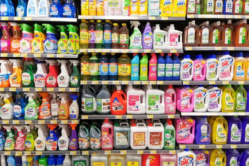
Research into grocery layouts and planograms shows that the way products and departments are arranged affects what customers encounter as they move through the space. Greater exposure creates more opportunities for unplanned purchases, which is why shelf allocation and product placement receive far more thought than most shoppers realise.
This does not mean every aisle is part of an elaborate plot to make you buy more in every shop. A useful layout still needs to help customers navigate the store. But convenience and commercial opportunity often sit side by side. The more of the range you see, the more chances there are to remember something you forgot and discover something new.
That balancing act plays out differently from one retailer to the next. Coles, Woolworths, Aldi and independent IGA stores can all feel noticeably different to walk through, because each one builds its layout around its own research. Space planners and category management teams work out which layout feels most natural to their customers, then weigh that against store efficiency and cold-chain logistics. That mix of priorities is why you often find fresh fruit and veg at the entrance, milk and dairy at the back, long-life goods in the middle and frozen goods along the far wall.
Moving One Item Changes the Whole Trip
When a familiar product moves, the customer has to stop shopping on autopilot. This is what a planogram update looks like from the shopper’s side: it prompts them to scan the aisle signs, look across nearby shelves and sometimes walk through a completely different part of the store.
That extra movement matters because shoppers can only consider buying products they actually notice. Point of sale (POS) displays near the front may encourage impulse purchases, while secondary placements, additional spots elsewhere in the store where a product is merchandised outside its usual aisle, can remind customers about a product or bring it back to their attention.
A small layout change can, therefore, introduce customers to:
- A new or improved product sitting where the usual one used to be (think lower-salt or sugar options)
- A promotion placed along the new route (think multi-buys and buy-together offers)
- Products commonly purchased with the item they were seeking (think corn chips and salsa dip)
- An entire aisle they normally skip (think pet food or health food and vitamins aisles)
For retailers, the opportunity is discovery. For customers, it can mean noticing products and offers they would otherwise have passed by.
Costco Wants You to Wonder What Is Here Today
A regular supermarket usually rewards familiarity. Costco adds an element of uncertainty.
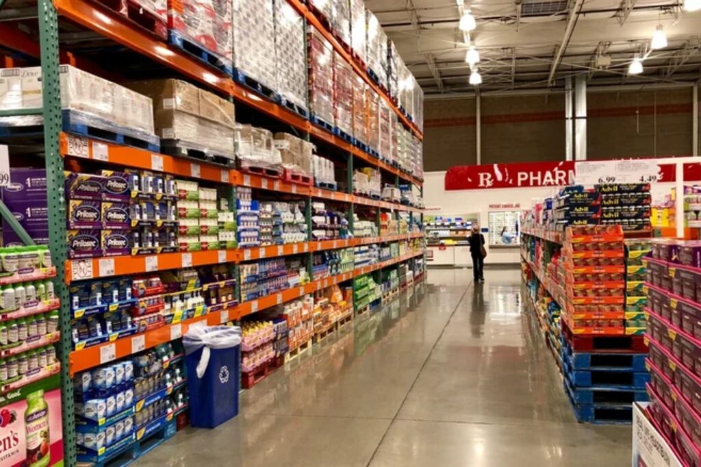
The company openly describes its warehouses as having a “treasure hunt atmosphere”, with exclusive and one-time-buy products rotating through the range. Its advice to members is simple: visit often, because the interesting deal they see today may not be there next time.
That unpredictability gives customers a reason to browse rather than head directly towards one product. The weekly shop can suddenly include an outdoor heater, a box containing 48 pastries, or a patio set you had no plans to buy.
Costco’s approach relies on a few powerful feelings:
- Curiosity: What has appeared since the last visit?
- Scarcity: Will it still be available next week?
- Discovery: What might be waiting in the next aisle?
- Urgency: Should we buy it now and work out where to put it later?
The changing selection keeps the warehouse from becoming completely predictable. Customers may know the essentials they came for, but they cannot know every offer they will encounter along the way.
Familiar Enough to Navigate, Different Enough to Notice
There is a balance here. Constantly moving everyday products can frustrate loyal customers, particularly when they are in a hurry. It’s not that supermarkets are trying to make life harder for you; planogram changes are usually driven by seasonal stock, supplier deals or new product lines, and loyal shoppers just feel the disruption more. A store that feels difficult to navigate may encourage people to leave rather than explore, and that same tension exists everywhere customers browse, including online.
Think of your website as a supermarket; it has its own aisles, signs and shelves. The navigation menu shapes what visitors can find, the homepage controls what they notice first, and internal links or related recommendations influence where they go next. A clear digital journey helps people complete the task they arrived for while still introducing them to other useful products, services or content.
As we explored in our article about how low-cost offers can lead to larger purchases, the first thing that brings someone in is rarely the only thing that matters. The real opportunity is what they discover once they arrive.
Before You Change Your Shopping Routine
Whether you are changing a store layout, website menu or customer journey, every adjustment should have a clear purpose. The goal is to help people notice something useful, not make them work harder to find what they already came for.
Before making a change, ask:
- What are visitors trying to find first?
- What should they naturally discover next?
- Which pages, services or products are being overlooked?
- Does the new journey make exploration easier or simply add friction?
- Can people still complete their main task quickly?
Good retail marketing strategy does not force people to explore. It creates a clear path that makes the next useful step natural.

Did You Find What You Came For?
The most effective strategy rarely feels designed. Customers simply move from one step to the next without stopping to question why a product, page or offer appeared at exactly the right moment.
That is the standard worth aiming for when designing a website or planning any digital customer journey. Each page, link and call to action should feel intuitive, relevant and easy to follow, so the experience supports the decision instead of getting in the way.
If your website is attracting visitors but not guiding them towards the right action, Ignite Search can help simplify the journey and improve how people move through your digital experience. Get in touch with our team today.