
By Airon Rodrigues
Converting potential customers has long since been the very last piece of the puzzle. Regardless of the industry, there are certain design elements that lead to conversion and certain elements which don’t. To succeed in conversion rate optimisation (CRO), knowing fundamental design elements that can make or break a conversion is crucial.
Design elements are fundamental to achieving and maintaining a high CRO.
Here are 6 design principles to kick off the CRO process.
CTA, or Call-To-Action.
Having a call-to-action is important. Without it, the user is left feeling lost, unsure and frustrated. One of the main reasons a landing or sales page may not be converting is due to a weak call to action with no sense of urgency.
How can CTA’s be improved?
It all comes down to how the CTA is designed and presented.
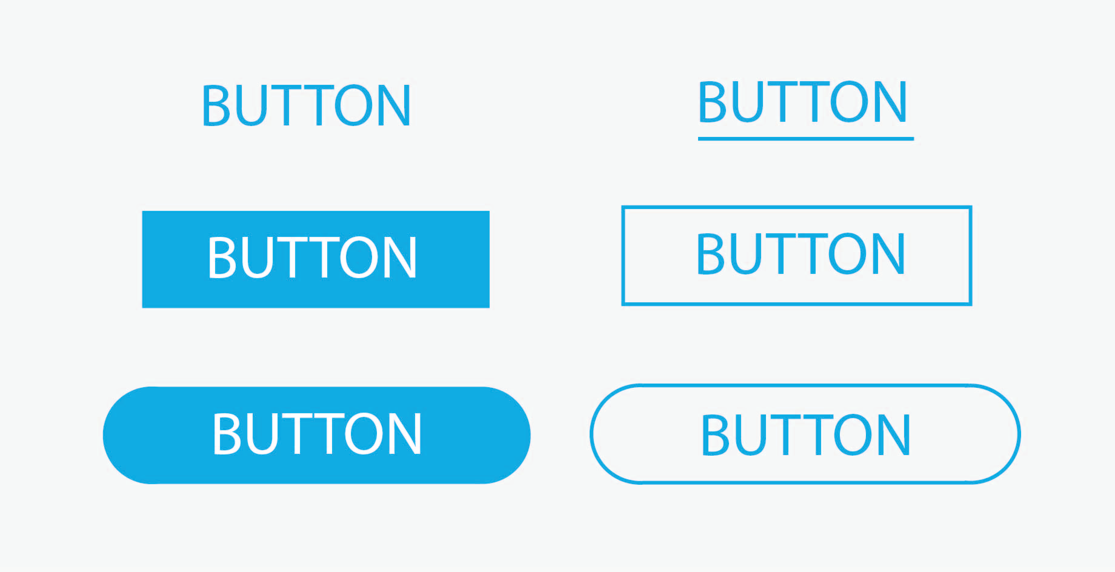
A classic technique when trying to direct an audience toward a specific element (CTA) is using buttons. Having the CTA placed within the button allows visitors clearly to identify in a matter of seconds what action is expected from them on the web page.
Here’s an example of Evernote; notice how a ‘cliffhanger’ is used to get users to ‘Go Premium’ (CTA) on their homepage.

A general rule of thumb when evaluating the design of the CTA is to look at the page and squint. If the CTA doesn’t stand out when squinting, the design may have to be reconsidered.
Square buttons are the most popular shapes of buttons, as they are easy to recognise as a clickable object. However, it’s reported that CTA’s with rounded corners enhance information processing, which is something to keep in mind.
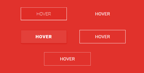
In addition to the shape, another way to enhance the design of buttons is using an on-hover effect. Meaning, when the cursor is placed over the button, the design will change. Here’s an example:
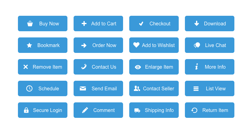
How about icons? Should they be included in the design of the CTA?
Mike Parkinson from Billion Dollar Graphics suggests that humans process images and numbers close to 60,000 times faster than processing words.
Ultimately, icons encourage action. Including visual elements in the CTA can help to increase conversion rates. Here are some examples of icons:
Contrasting Colours
As previously mentioned, a CTA button can highly impact the actions of the user. But where does colour come into play? Does a web page need contrasting colours to entice visitors?
The answer to that is yes. The more a call-to-action stands out from its surroundings, the easier it will be to see.
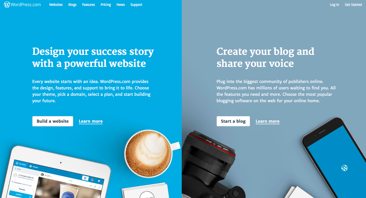
A great example of contrasting colours is WordPress. Notice how the use of colour immediately allows the CTA to stand out. The key is to find a contrasting colour that stands out but still works with the overall design of the brand.
Do all colours work? If it’s congruent with the brand and stands out, yes.
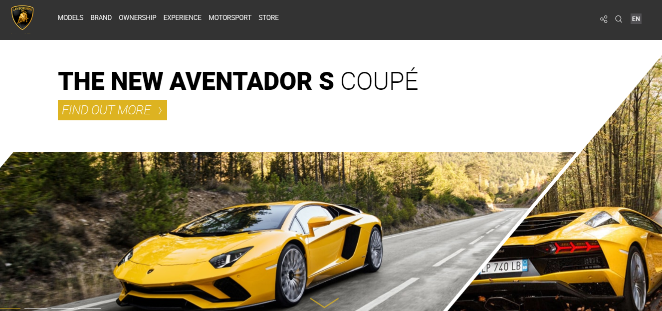
Lamborghini’s new Aventador Coupe shows how even a yellow CTA design can be used for a masculine brand.
Webnode is another great example of a CTA used that contrasts with the rest of the page:

Colour can be used to provoke an emotional response. For example, dark blue is associated with being stable, calming, trustworthy and mature.
To achieve a CTA that stands out, set is as the opposite colour of the background. Simply locate the background colour on a colour wheel, and set the CTA as the opposite colour. For example, the opposite of green would be red, and the opposite of purple will be yellow.

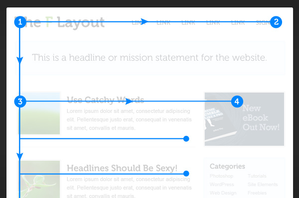
Understanding the F-Layout
According to research, a user’s natural behaviour when browsing a web page is to read the screen in an “F” pattern.
The F-Layout relies on eye tracking studies explaining that web surfers read the screen in an “F” pattern, seeing the top, upper left corner and left sides of the screen most.
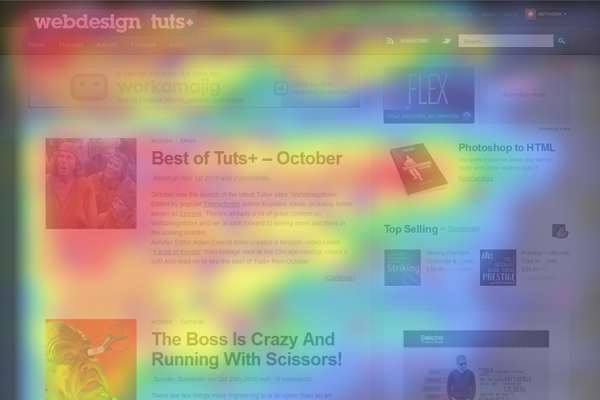
Below is a heat map that shows where users generally gravitate towards. Red, orange and yellow spots represent where user’s attention is focussed on the most.
Here is a wireframe version of the F-Layout:
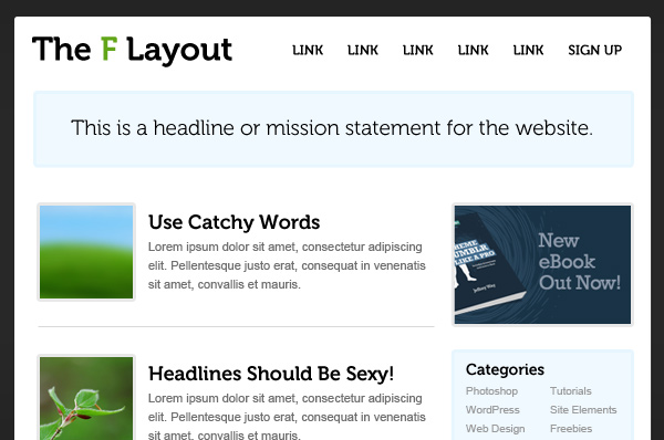
The F-Layout works because it allows users to view a web page naturally. Having an easy-to-read page can guide users to desired design elements.
The Rule of Thirds
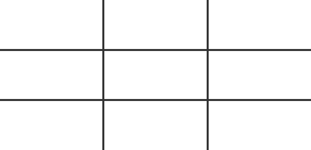
What is the rule of thirds? One of the most popular photography principles is to visually divide an image or page into thirds (both vertically and horizontally).
Resulting in nine rectangular squares:
According to this rule, the four middle intersections are strategic places of interest. When objects are placed on these points, it creates the most impactful design.
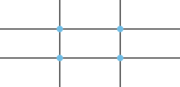
What does this look like in action?
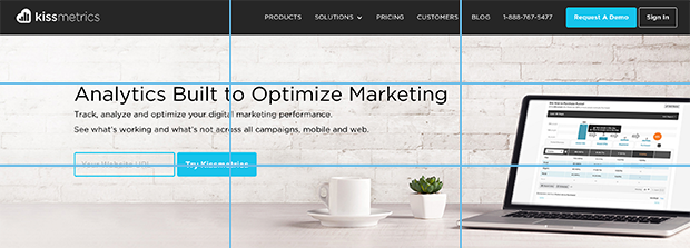
Kissmetrics places their call to action button at the bottom left intersection. Notice how the top navigation bar is not within the four-main intersection; this helps users focus on the CTA for the page. The principle works for conversion because it identifies the most important elements on page quickly.
Negative Space
When it comes to utilising negative space, the case remains that less is more. In web design, white space is often related to negative space.
Positive space contains elements and text whereas negative space is left empty.
So why is this so effective? Without negative space, a website would be unreadable and unusable. Negative space helps draw the attention of the user to the elements on the page.
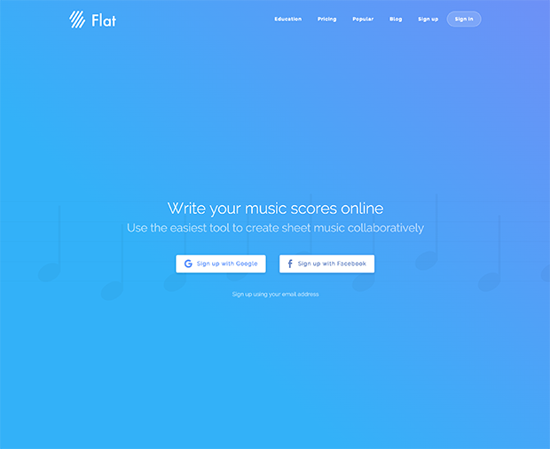
Falt.io uses negative space on their homepage to keep the focus on their call to action, which is to sign up with Google or Facebook.
Dropbox also applies negative space to their design:

The purpose of negative space is to allow your call-to-action to stand out from its surroundings and give the user only one thing to focus on.
Limiting Options
What happens when someone is faced with one or two options? They either opt for it or opt out of it.
Limiting the number of options is not applicable to every site, but can be a powerful CTA design technique when used properly. To achieve this technique, remove all other links and have the entire page revolve around a call to action.
This is risky and aggressive because the user is now being forced to decide between clicking the CTA or leaving the site.
The benefit of this strategy comes from distinguishing which users are window-shoppers, and which users are serious buyers. It’s a powerful filtering option that is only advisable if:
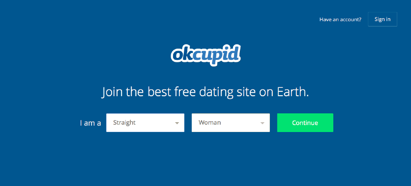
- The user is already invested in the site. For example, OKCupid doesn’t need to explain to their users what happens if they sign up as they already have a well-known reputation.
- The CTA isn’t asking too much. This strategy works well for eliciting users to fill in sign-up forms or subscribe to mailing lists.
Conversion rate optimisation is one of the most important parts for any website looking to persuade their audience to commit to a specific action. There is no singular rule or design in achieving a high CRO, however fundamental design elements mentioned in this post are a great way to get started by covering the basic principles needed to help increase conversion.
Looking to get CRO services done for your website? Speak to us today about how we can take your CRO to the next level.


