Why did we do a logo facelift and why does it matter? Celebrate this exciting milestone with us at our fast-growing digital marketing agency.
Ignite Search is currently growing faster and bigger than ever before.
- From our humble Search Engine Optimisation (SEO) beginnings in 2014, we are now a full-service English/Chinese digital marketing agency.
- We are proud to provide eight categories of digital marketing services that strengthen three key pillars of marketing that fuel business success.
Despite the team and the business growing and changing over the years, our original logo mark has remained the same for eight years—until today!
Before I tell you more about our exciting new logo, let’s first ask ourselves:
- What is a logo?
- Why do logos matter?
What is a logo?
Simple answer: a logo is a symbol composed of text, images, and colours. The aim of a logo is to represent and identify a product or business.
As you know, logos may come in all different shapes, sizes, and styles, but their true value is based on one factor: Recognition.
Here are some examples of highly recognisable logos:
![Types of Logos: Learn the Essentials in Minutes [+ Cool Examples]](https://i.graphicmama.com/blog/wp-content/uploads/2020/12/11104758/wordmark-logos.jpg)
Why do logos matter?
When I am asked this question, I like to place myself in the shoes of a start-up CEO.
What exactly do I need to succeed when nobody knows who I am?
Your first thoughts might be:
- A great idea – Yes, it all starts with a ‘lightbulb’ solution to an existing problem.
- Money – Obviously! Yes, lots of it please, to bring the idea to life.
- Dedication – You got it right. Being prepared to hustle, and say goodbye to relaxing evenings after work and leisurely weekends.
But something else that is super important is often underestimated. And that is:
Confidence.
Without confidence in your branding, you will be miles behind your competitors who already have it. Your logo must express it.
So, when do you feel the most confident?
After taking the time to invest in yourself.
Putting in that effort to eat a healthy diet. Working out regularly. Wearing that completely new outfit, and maybe trying a new fragrance!
You simply feel like your best self when you put in the effort to get great results.
A company’s logo is the same.
It symbolises your brand’s body of work. An entire business represented by a single symbol.
If you don’t invest in making that symbol spectacular, it’s never going to feel like it is the best representation of what the company deserves to be (internally or externally).
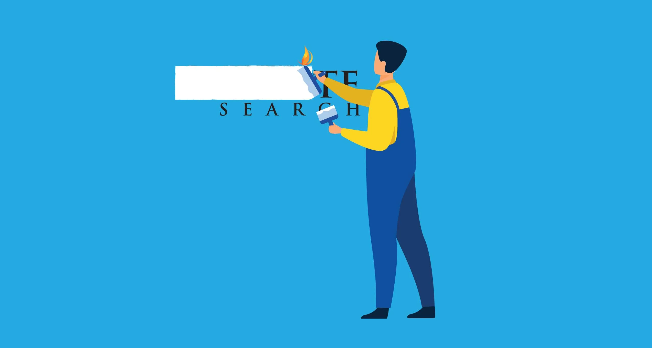
Why did we put in the effort to refresh our logo? To update it and express who we are right now with confidence.
Our new logo
The task with our new logo was to build something from existing brand elements.
Why not an entirely new logo, you may ask?
Well, you’ve read it above: Recognition!
It was important to keep our established identity and not deviate from the original logo too much.
Market research revealed that ‘Ignite’ is a popular business name. It was essential for us to do our homework so we don’t end up designing a logo that looks like everyone else’s.
With all this in mind, we made our logo sleeker, flatter, and more streamlined.
Voila! Our new logo is now an updated representation of Ignite Search and our multi-talented and unified force.

Our logo transformation
It may seem like a small visual difference but a lot of thought guides the change. Here are some of the things we considered.
Less is More: Minimalism, simplification and the streamlined approach for logos is taking a surge in popularity in the world of design. In a digitalised world, we need logos that display well on all devices and materials, from smart watches to embroidery. So, we ditched the gradient in our old logo to modernise it. For both practical and aesthetic reasons.
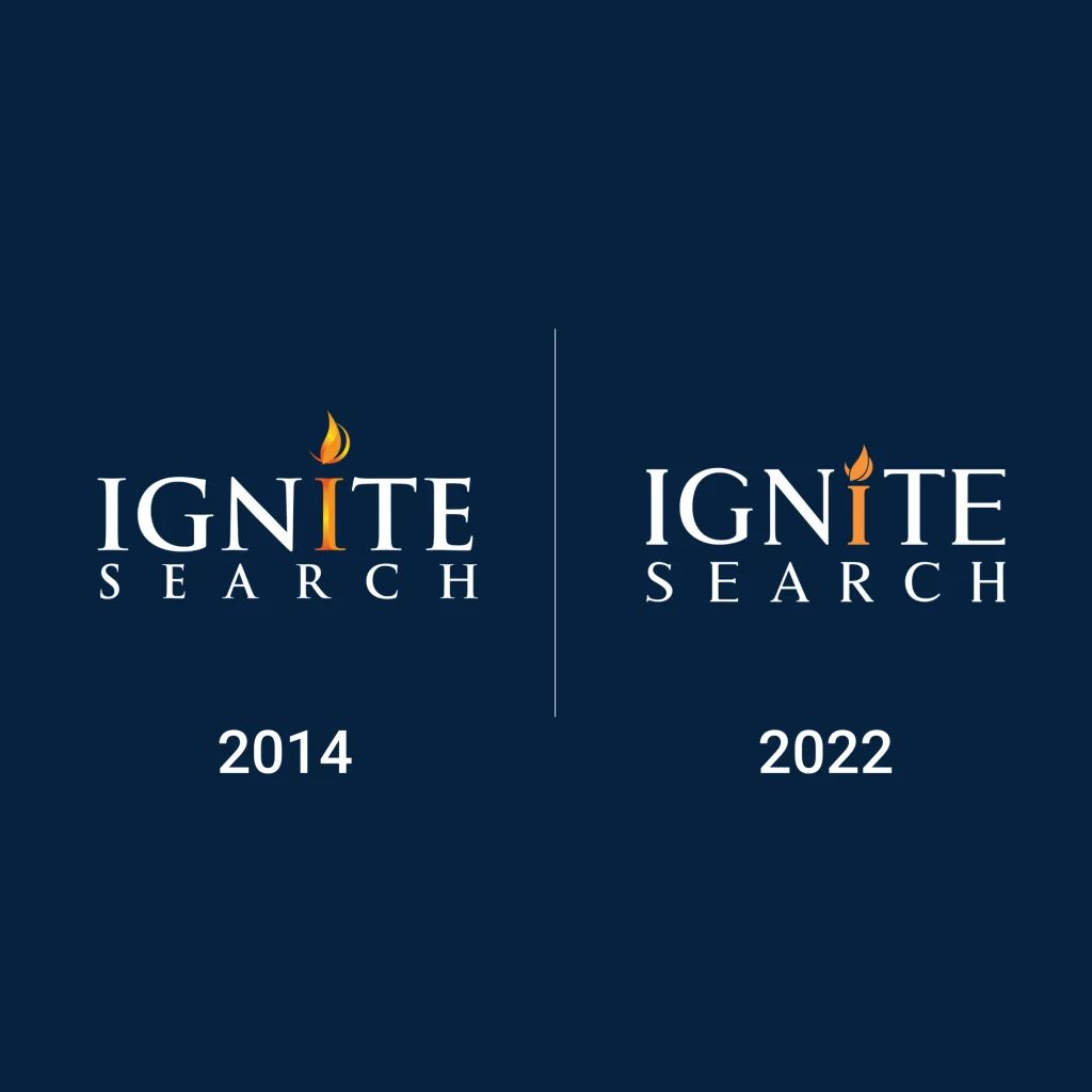
Facelift: Let’s face it, san serif typefaces are modern. They are trending and nearly everyone uses them—and that’s why we don’t. Our original logo font was strategic: it featured exaggerated serifs to inspire trust in our young brand; moving away from that would be too much change. Our brand wishes to portray trustworthy timeless elegance, and a serifed typeface helps us achieve this.
Recognisability: Sticking to our serifed roots and signature orange corporate colour were critical for maintaining brand equity. To set ourselves apart from the many businesses named Ignite around the world, we remain recognisable without hiding within the comfort zone of our original logo.
Leading by example: Updating our logos design elements adds fresh energy into a logo that will grow with us as we continue to innovate at Ignite Search.
You could say it’s one small step for logo design, one giant leap for our business.
Now, what about your business?
Take a look at your business logo. Is it something you can bring to the future with confidence or is it stuck in the past?
Not sure?
Ignite Search will be glad to help! Start a conversation with us to leverage our expertise. Meanwhile, did you know that strong branding can increase profitability?