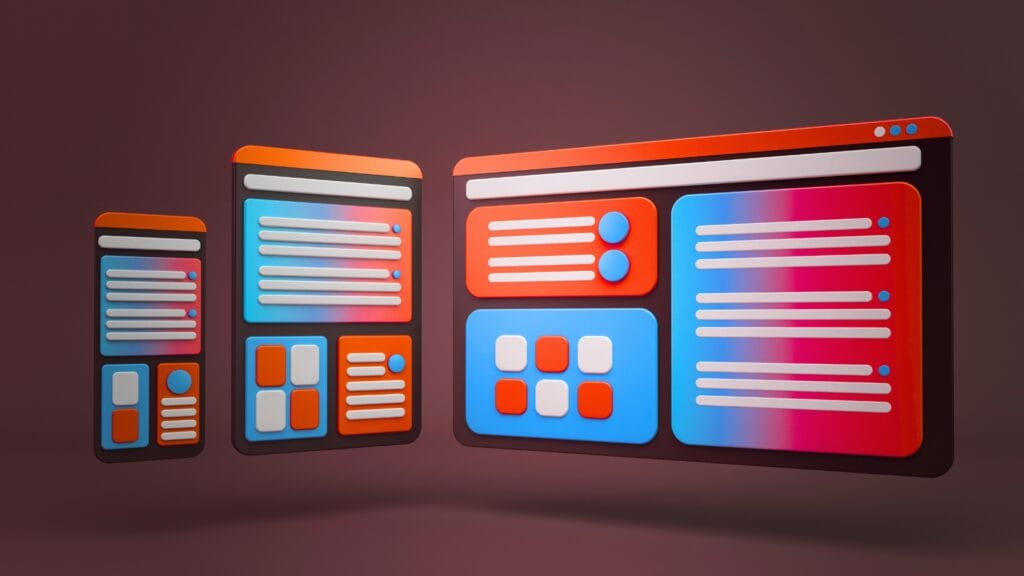
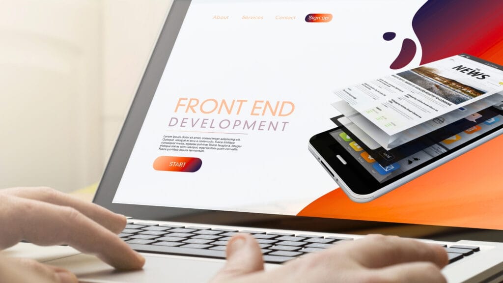
7 Patterns of Reading Behaviour for Effective Content Design for Websites
You can spend hours writing brilliant webpage copy, polishing every sentence until it sounds perfect, only for visitors to leave after 15 seconds. Harsh, but true. Most people do not read websites the way they read books. They skim, jump around, scroll unpredictably, and hunt for quick answers. That is exactly why UI/UX optimised website content design matters more than most businesses realise. At Ignite Search, we often see businesses pour energy into visuals and SEO while overlooking one thing that quietly shapes conversions: how people actually consume content online. Our Digital Performance Designer, Lewis, puts it plainly: users do not read, they scan and prioritise, and your design needs to be built around that reality from the ground up.
The good news is that reading behaviour is surprisingly predictable. Decades of usability studies and eye-tracking research in UI/UX Design have shown that users follow common scanning patterns across websites. Here are the seven core reading behaviour patterns you need to understand, and more importantly, how to use each one to your advantage.
1. The F-Pattern
One of the most widely cited findings in digital usability comes from Nielsen Norman Group, which discovered that users often scan webpages in an F-shape. People read the first line or two across the top, then their eyes drift down the left side of the page in shorter and shorter glances. By the time they are a few paragraphs in, they are barely reading horizontally at all.
This means anything buried deep inside a long paragraph is functionally invisible to most visitors. The practical fix is straightforward:
- Open every section with its most important point, not a build-up to it.
- Keep your first sentence doing real work, not warming up to the actual message.
- Place key details at the start of bullet points and sentences, not the end.
- Follow a clear H1 to H2 to H3 heading structure so F-pattern readers always know where they are on the page.
Think of it like a newspaper front page. The headline gives you the story. The first paragraph fills in the essential detail. Everything after that is for readers who want more. Your webpage should work exactly the same way.
2. The Spotted Pattern
Sometimes users are not reading at all in the traditional sense. They are hunting for one specific thing: a price, a phone number, a service name, a “get started” button. When a reader is in spotted mode, everything else on the page disappears for them.
This is where visual hierarchy does the heavy lifting. If your pricing is buried inside a paragraph, spotted readers will leave and assume you are hiding something. If your phone number sits in plain sight at the top of the page in a contrasting colour, they find it in seconds and move forward.
A few ways to support spotted reading:
- Use bold text for the specific details people search for, not just for general emphasis.
- Put contact details, prices, and key CTAs somewhere obvious rather than tucked away in the footer.
- Use strong contrast on buttons so they stand out without the user actively hunting for them.
- Break up text with enough white space that the eye can land cleanly on what it is looking for.
3. The Layer-Cake Pattern
This pattern describes readers who jump between headings and subheadings without reading the body copy in between. Think about the last long article you opened online. Chances are, you scanned the headings first to decide whether it was worth your time. Most users do exactly the same.
Headings are not just visual formatting. They are a parallel story running through your page. A reader who only reads your headings should still walk away understanding what the page is about and why it matters. A heading like “Why your contact form is losing you leads” tells a story. A heading like “Contact forms” tells you almost nothing. Generous whitespace between sections helps too, giving the eye a natural place to rest rather than forcing every section to compete for attention at once.
Structure also matters just as much as writing quality. If you want to dig deeper into how content structure affects both readers and search performance, our article on the secrets to a successful content marketing strategy is worth a read.
4. The Commitment Pattern
Once readers believe your content is genuinely useful, their behaviour shifts completely. Instead of scanning, they begin reading carefully and spending more time on the page. This shift almost always happens because the introduction quickly addressed something the reader actually cares about.
Generic openings that start with phrases like “In today’s fast-paced digital landscape…” are one of the fastest ways to lose someone who was otherwise ready to commit. Readers are impatient, but they are also highly motivated once they believe a page will solve a real problem for them.
The rule is simple: deliver value in the first three sentences, not the first three paragraphs. And once they are reading, keep the experience smooth. Body text smaller than 16px, lines that stretch too wide, and tight line spacing all create friction that pulls even a committed reader back out.
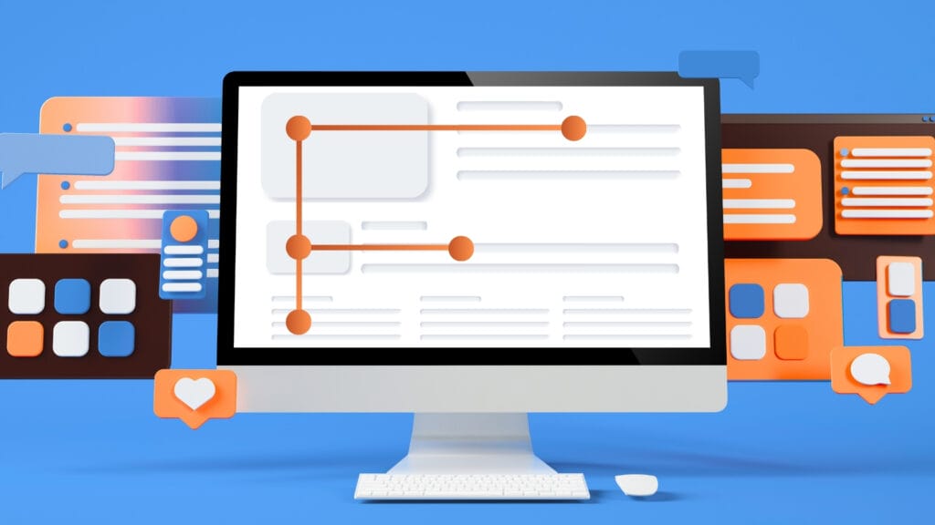
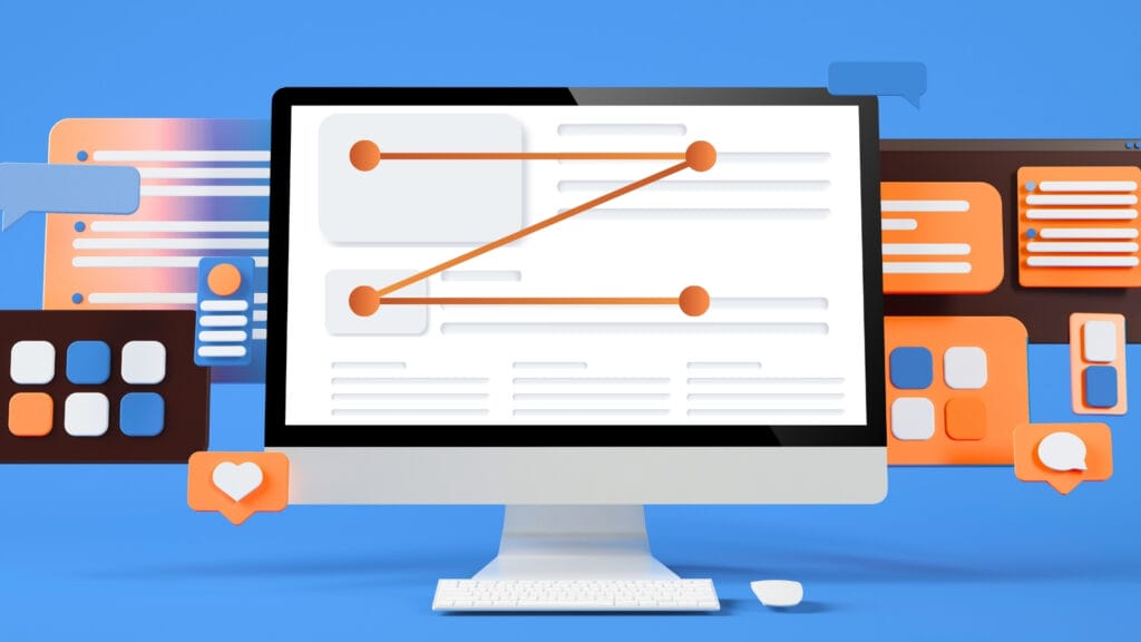
5. The Z-Pattern
On landing pages and modern website layouts, readers often scan in a Z motion rather than straight down. Their eyes bounce between a headline on one side, an image or supporting detail on the other, then back across to a button or short text block. This is especially common on mobile, where users scroll fast and make split-second decisions about whether to keep going.
A well-designed landing page works with this zigzag pattern naturally. Alternating layout sections, where text appears on the left in one block and the right in the next, create a visual rhythm that guides the eye without the reader noticing it is happening. Apple’s iPhone page is a strong example of this done well, and it is one reason it feels easy to browse even when there is a lot of information on screen.
To support Z reading on your own site:
- Alternate the position of text and visuals across layout sections.
- Keep individual text blocks short so neither side of the page feels heavier than the other.
- On mobile, keep important buttons within easy thumb reach rather than pushed to the edges of the screen.
- Place CTAs where the eye naturally lands after each zigzag, not just anchored to the top and bottom of the page.
6. The Selective Reading Pattern
Online readers filter aggressively. Anything that feels repetitive, overly promotional, or irrelevant gets skipped almost immediately. This is not a flaw in your audience. It is a learned response from people who are bombarded with content every single day.
Conversational writing cuts through that filter because it does not sound like it is trying to sell something. Content that reads as a helpful conversation gets absorbed. Content that reads like a brochure gets scrolled past. The same applies to images: generic stock photos signal to selective readers that a page was assembled rather than thought through, while purposeful visuals with a clear caption actually get read.
A practical test: read your page out loud. If any sentence sounds stilted or awkward when spoken, rewrite it until it does not. The words that survive that test are usually the ones that actually get read.
7. The Scroll-and-Pause Pattern
Most users scroll continuously until something makes them stop. That pause might happen because of an unexpected statistic, a frustration stated plainly, a well-placed image, or a heading that feels like it was written specifically for them. Once they pause, they are far more likely to read the surrounding content in depth.
The best content builds multiple pause moments into the page rather than relying on one big hook at the top. Some ways to create them:
- Use a short, punchy sentence after a longer one to change the pace.
- Drop in a specific number or a counterintuitive detail where attention tends to drift.
- Ask a question the reader is already asking themselves.
- Use directional cues like arrows or a visual pointing toward the next section to keep the eye moving forward.
The goal is not just keeping users on the page longer. It is making the experience feel effortless enough that they want to keep going.
Why Reading Behaviour Matters
Modern readers are dealing with more information than any generation before them. Every website, social feed, and inbox is competing for the same limited window of attention. If your content feels dense or hard to navigate, they will leave before they reach your main message, and most of them will not come back.
That does not mean people dislike reading online. It means they expect efficiency. Writing, structure, typography, visual hierarchy, and mobile experience all feed into the same outcome. When content is designed around how users actually behave rather than how we wish they would, bounce rates drop, engagement lifts, and the path to conversion becomes clearer for everyone.
If you want help auditing your website content or building UI/UX Designed structure that genuinely works for real readers, get in touch with the Ignite Search team.