





Sit in enough meetings and you will hear it. Someone says the website “needs better UI/UX“, everyone nods, and the conversation moves on before anybody admits they are not exactly sure what was just agreed to.
It is a term that got popular faster than it got explained. Designers use it, agencies put it on their service pages, and somewhere in the middle sits a business owner who just wants to know whether any of it will make the phone ring.

What is UI and UX? Two different jobs
They are often written as one word, “UI/UX”, which is where most of the confusion starts. They are related, but they are not the same thing, and the people who implement them well are often not the same people.
UI stands for User Interface. It is everything a person sees and touches. Buttons, colours, fonts, spacing, the animation when a menu slides open. If you can point at it on a screen, it is UI.
UX stands for User Experience. It is the thinking underneath. What order do things appear in? How many steps does it take to book a consultation? Where does a visitor get confused and leave? Don Norman and Jakob Nielsen defined it in 1998 as every aspect of someone’s interaction with a company, its services and its products. Nobody points at UX. They just feel it, usually as frustration.
UI is how it looks. UX is how it works.
UI vs UX: Two ways to picture the difference
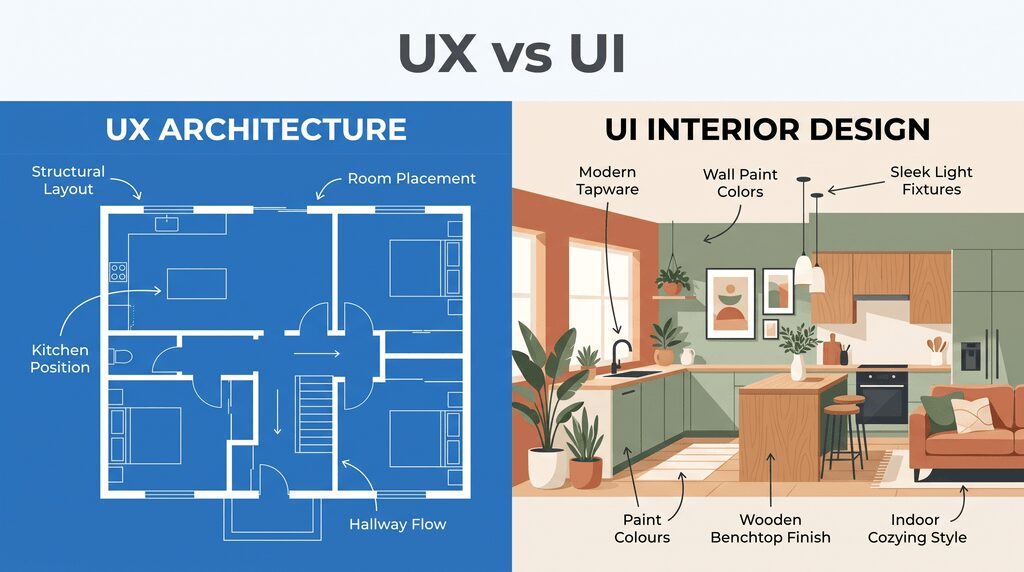
The blueprint and the finished house
UX decides where the kitchen goes. Whether you have to walk through the lounge room to reach the bathroom. UI decides the wall colour, the tapware, and the benchtop finish.
Here is the uncomfortable bit. You can repaint a house in a weekend. Moving the kitchen means tearing up the floor, which is why the structure of a website build is worth more argument upfront than the colour palette.
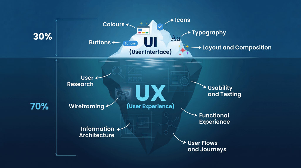
The iceberg
UI is the part above the waterline. Visible, photographable, and the bit everyone comments on. UX is the nine tenths below: the research, the testing, and the reason the enquiry form asks for four fields instead of eleven.
Clients see the tip. The tip only stays above water because of everything underneath it.
Why this matters for marketing, not just websites
You can spend thousands driving traffic to a page. Paid ads, SEO, and a social campaign that actually performs. All of it ends in the same place, which is a person on a screen deciding whether to take one more step.
If that step is unclear, slow, or buried under a cookie banner and a newsletter popup, the money you spent getting them there is gone.
Baymard Institute puts average online cart abandonment at around 70 per cent across dozens of separate studies, and estimates roughly a third of checkout abandonment is preventable through better design alone.
We see the same pattern in audits. The traffic is fine, the rankings are fine, and the conversion rate is quietly strangling the campaign because nobody treats it as a marketing problem. UX is the last mile of everything you run.
How to apply UI/UX thinking without a full redesign
Watch someone use it
Not a designer, and not your marketing manager. Find someone who resembles your actual customer, give them a task, and say nothing while they attempt it. “Find out how much this costs and request a quote.” It is an uncomfortable twenty minutes and the cheapest research you will ever do.
Count the steps
From landing on the page to submitting an enquiry, how many clicks, scrolls and form fields are there? Then ask which you could remove. Most forms collect information nobody uses until the third conversation.
Check it on a phone, properly
Not a desktop browser squeezed narrow. An actual phone, outdoors, on patchy mobile data. Most of your traffic arrives this way, and almost nobody tests this way.
Make the next action obvious
On any given page, what is the one thing you want someone to do? If a visitor cannot answer that in about three seconds, the page is doing too much.
Look at where people leave
Exit pages, scroll depth, and the form field where people abandon. UX problems leave fingerprints, and the data is usually sitting there untouched. This is the whole premise of conversion rate optimisation: work the traffic you already have harder before buying more of it.

The short version
UI is what people see. UX is what people go through. The difference between UI and UX is the difference between looking credible and actually getting the enquiry.
When the budget is tight, fix the structure before the surface. A good-looking site that nobody can navigate is an expensive way to lose enquiries politely.
You can spend thousands driving traffic to a page. Paid ads, SEO or a social campaign that actually performs. All of it ends in the same place, which is a person on a screen deciding whether to take one more step.
If that step is unclear, slow, or buried under a cookie banner and a newsletter popup, the money you spent getting them there is gone.
Baymard Institute puts average online cart abandonment at around 70 per cent across dozens of separate studies, and estimates roughly a third of checkout abandonment is preventable through better design alone.
We see the same pattern in audits. The traffic is fine, the rankings are fine, and the conversion rate is quietly strangling the campaign because nobody treats it as a marketing problem. UX is the last mile of everything you run.
Frequently asked questions
What is the difference between UI and UX design?
UI design covers the visual layer: layout, colour, type, buttons and states. UX design covers the structure and sequence behind it: what goes where, in what order, and how many steps it takes to finish a task.
Is UI/UX only relevant to apps and websites?
No. The same thinking applies to a booking process, an email sequence, a quote document or how someone is greeted in a showroom. Anywhere a person moves through steps to reach an outcome, there is an experience being designed, whether anyone meant to design it or not.
Does UX include accessibility?
Yes, and in Australia it carries legal weight. The Australian Human Rights Commission published guidelines in April 2025 setting out how the Disability Discrimination Act 1992 applies to websites, apps and digital services. A site that excludes people is not just a design problem.
How do I know if my UX is the problem?
Healthy traffic with weak conversions is the classic signal. If people are arriving and leaving without acting, the issue is rarely the ads.
How much does improving UX cost?
Anywhere from a few hours restructuring one landing page to a full rebuild. The more useful question is what your current drop-off rate is already costing you each month.
Can good UI make up for bad UX?
Briefly. A polished interface buys you a few seconds of goodwill. After that, people judge you on whether they got what they came for.
At Ignite Search, we treat UI and UX as part of the campaign, not separate from it. If your traffic is healthy but your enquiries are not, we can audit where people are dropping off and what it is costing you. Get in touch for a conversation about your site.