You’ve poured time, energy and budget into your website. It looks sharp, loads quickly and might’ve even earned a few compliments at the last meeting. But here’s the million-dollar question: are visitors actually using it the way you expected?
Are they clicking on the right things, following the journey you’ve laid out, and landing on your calls to action? OR are they doing the digital equivalent of walking into your store, looking around confused, and walking straight back out?
At Ignite Search, we help businesses map out and optimise user journeys and apply our understanding of how real people interact with your website, which is one of the smartest ways to lift performance, boost conversions and get a better return on all that effort. So here is everything you need to know about user journey mapping, website layout optimisation and more.
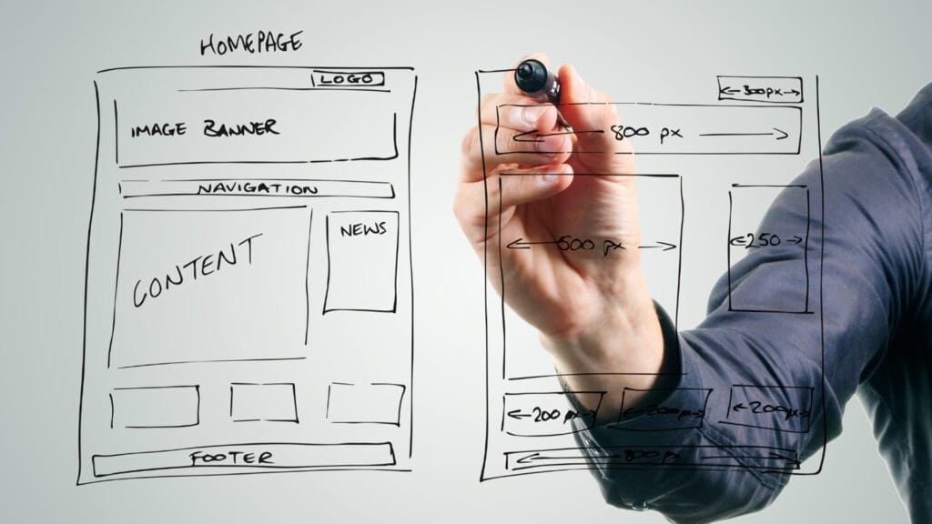
What Is a Website User Journey and Why UI/UX Matters?
A website user journey is the path someone takes through your site from the moment they land to the moment they convert (or don’t). It includes every click, scroll, pause, and hesitation along the way. It’s deeply influenced by your site’s UI/UX design. Good UI (User Interface) and UX (User Experience) help users find what they need faster, engage longer, and feel confident in taking action.
Even the best-looking sites often have blind spots, especially when they value aesthetics over functionality. Important info buried below the fold. Call-to-actions in places no one’s looking. Pages designed with great intentions but poor results. These are what you are looking for when you are determining an effective website from a website that did little more than burn a hole in your pocket.

Hot Zones, Cold Spots and Missed Opportunities
Websites tend to have areas that draw attention (hot zones) and areas that get ignored (cold spots). You’d be surprised how often your most strategic content lives in the latter.
Your footer? Might be a ghost town. That side widget? Probably overlooked. Meanwhile, people might be spending all their time on your About page or blog without encountering a single offer or lead form.
This is where smart layout comes in. Taking a top-down approach to your content structure, especially “above the fold,” ensures key messaging appears right where people look first. Your site’s UI/UX should naturally guide users through this journey without friction or confusion.
(Note: “above the fold” refers to the portion of a web page that’s visible without scrolling. Think of it like the top half of a newspaper; it’s the first thing people see when your website page loads.)
If people are spending time halfway down your homepage or deep-diving into your FAQs, don’t leave those zones empty. Put your best foot forward where the traffic already flows.
These are just some of the best practices we apply at Ignite Search to transform a business’s digital vision into real-world results.
Tools That Pull Back the Curtain on Your Website User Journey
There are some great platforms available that let you watch, learn and adapt based on how people actually use your site.
Hotjar
Hotjar gives you heatmaps and user recordings that highlight where people click, move, and scroll. You can even ask them what’s working or not via quick on-site surveys.
Pro Tip: Hotjar is solid for surface-level insights but only captures a sample of sessions unless you upgrade to a paid plan.
Smartlook
Smartlook is great for replaying full user sessions and tracking funnels. Want to know why someone dropped off before submitting your form? Smartlook shows you.
Pro Tip: It offers powerful tools even on the free plan, but storage limits can restrict how much data you can review over time.
Microsoft Clarity
Clarity is a free, privacy-compliant tool that shows scroll depth, rage clicks (yep, that’s a thing) and session replays. It’s a good starter for businesses that want insights without the price tag.
Pro Tip: It captures every session and is totally free; however, it doesn’t offer surveys or user feedback tools like its paid subscription competitors.
What To Do With What You Learn
The real magic happens when you act on what these tools reveal. That might mean:
- Moving your call-to-action higher on the page (”above the fold”)
- Simplifying the layout where people get stuck
- Replacing ignored content with something more valuable
- Reworking your navigation so people can actually find what they came for
This isn’t just theory, it’s what we do every week at Ignite Search. We interpret behaviour data, test UI/UX design improvements, and help clients get more out of the traffic they already have.
Because sometimes, the difference between “browsing” and “buying” is a single scroll too far.
Ready to Get More From Your Website?
Our team at Ignite Search combines UI/UX expertise, behaviour tracking and strategic design to turn missed clicks into meaningful conversions. If you’re tired of guessing what’s working, let us show you what is and what can be optimised.
We offer user journey audits, heatmap setup, and full campaign support to help your site evolve with your audience.
Because at the end of the day, Ignite Search transforms your company’s vision into results.
Arrange a User Journey Audit with Ignite Search
Not sure if your site’s layout is helping or hurting? Let’s take a look together.
Click here to book your free consultation and we’ll walk through your site, highlight what’s working, and help you fix what’s not.
A few small changes could mean more engagement, more enquiries and yes, more conversions.