
Recognising the Missing Piece in Your Branding
You’ve launched your business with purpose and passion. Eager to get started, you’ve designed your own logo, selected colours and built promotional assets using online tools like Figma and Canva Pro. At first, everything appears functional, and your excitement is high. But over time, your visuals start to feel cluttered or inconsistent while lacking cohesion. When your brand isn’t resonating the way you hoped, the issue may not be what you’ve designed but how it’s been arranged, lacking impact. This is where the principles of visual balance in branding come in. That’s where Ignite Search can step in to help you assess, refine and elevate your brand’s visual identity using proven design frameworks.
Visual balance is a foundational principle in graphic design that refers to the even distribution of elements in a composition. Without it, designs can feel awkward, heavy on one side, or simply unprofessional. The concept is not exclusive to modern design theory; ancient cultures around the world have articulated similar ideals for centuries. For example, the Japanese principle of Wa, which embodies harmony and peaceful unity, strongly aligns with the goals of visual balance in branding. It encourages thoughtful, deliberate design that respects both space and proportion. At Ignite Search, we regularly help businesses audit and refine their branding by identifying where imbalances exist and correcting them using professional and high performing design techniques.
The Types of Visual Balance Ignite Search Use in Branding & Design
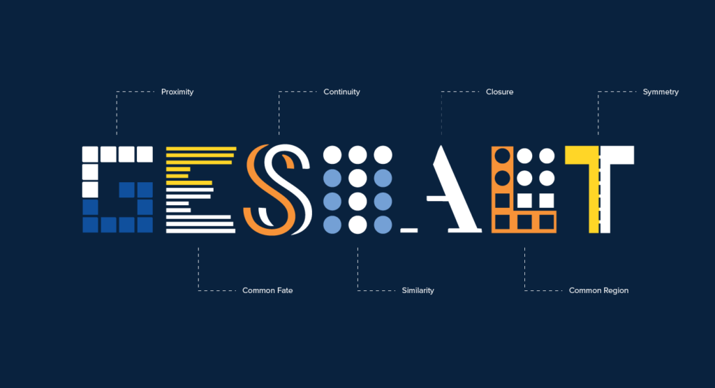
Professional designers utilise multiple types of balance depending on the brand tone, audience expectations and media format. These are often guided by the Gestalt principles of design, psychological theories that explain how people perceive and organise visual elements into unified wholes. Concepts like proximity, similarity, continuity, and closure help inform layout and spatial design decisions, ensuring a brand’s visuals are both aesthetically pleasing and cognitively coherent.
- Symmetrical balance: Where elements are mirrored equally on both sides of a central axis. Often used in luxury branding to create a formal, structured aesthetic.
- Asymmetrical balance: Balancing different elements (e.g. large with small, bold with light) to create a dynamic but stable layout. Common in modern, editorial-style branding.
- Radial balance: Elements radiate out from a central point. It’s less common in branding but can be impactful in logo design.
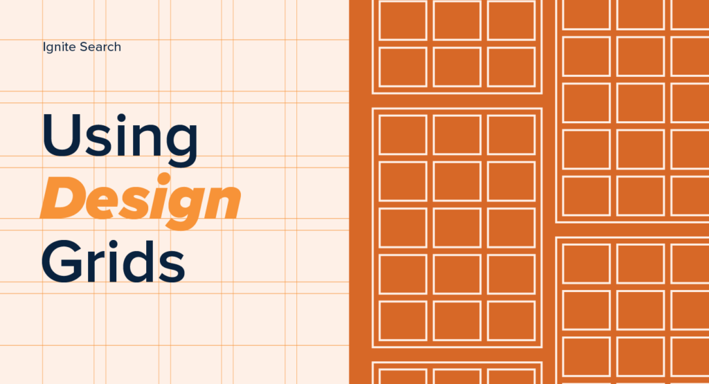
- Crystallographic balance: A grid-like pattern of evenly weighted elements with equal importance. Often used in packaging or pattern design.
Our team at Ignite Search applies these balance models alongside the Gestalt principles of design to bring structure, rhythm and cohesion to brand visuals.
Why Ignite Search Believes Visual Balance Is Essential in Branding & Design
When balance is used correctly, it achieves much more than visual harmony:
- Establishes hierarchy: Clear balance helps viewers understand what’s most important.
- Supports legibility: Balanced compositions improve scan-ability and accessibility.
- Builds Value: Professional-looking branding subconsciously signals reliability and expertise.
- Enhances recognition: A well-balanced brand identity is easier to recognise and recall.
At Ignite Search, we often work with brands that feel like they’re “almost there” but lack the design refinement to stand out. Through brand audits, visual identity development, and layout optimisation, we bring these near misses to full strength.
Technical Foundations of Visual Balance in Branding We Build On at Ignite Search
Good branding and design don’t happen by accident. Behind every impactful brand identity is a combination of what we call visual grammar, including:
- Grid systems: Used to structure content spatially, making elements easier to align.
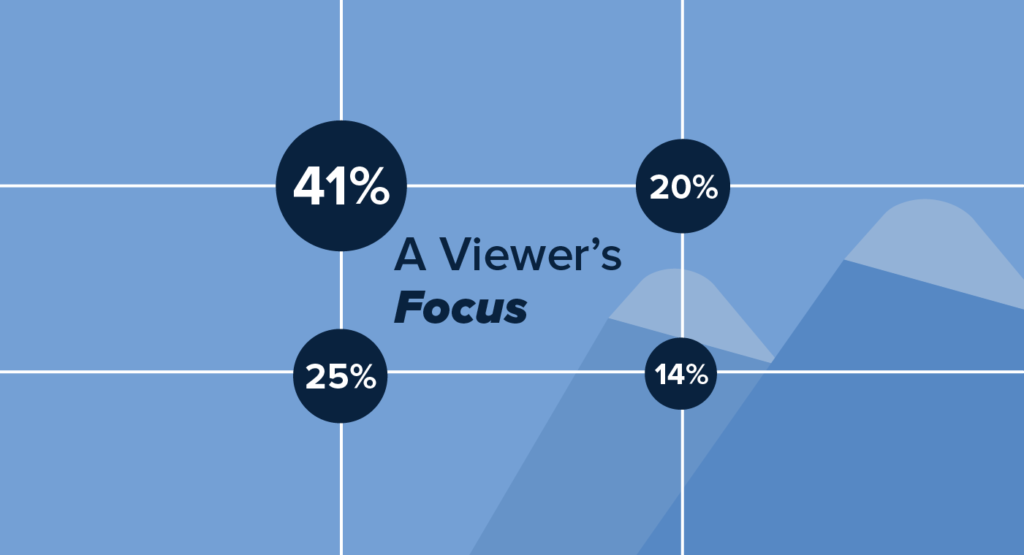
- Rule of thirds: A compositional technique used to position key elements off-centre for natural balance.
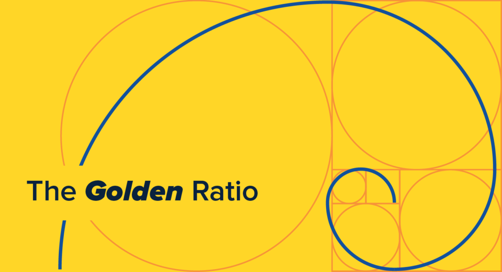
- Golden ratio: A mathematical ratio (approximately 1:1.618) often used to define proportions in logos and layouts.
- Typography hierarchy: Proper use of font weights, sizes, and spacing to guide the eye.
Our graphic designers are trained to integrate these principles intuitively across digital and print assets. At Ignite Search, every branding package, from logo development to style guide delivery, is crafted with technical discipline and creativity.
Ignite Search Insights: Why DIY Branding Often Lacks Balance
DIY branding platforms have empowered businesses to create their own visual identities, but not without limitations. Most templates are designed for mass appeal, not brand specificity. Without training in visual balance or formal design principles, users can end up with results that feel off without knowing exactly why. For example:
- Misaligned compositions: Elements that don’t seem to align neatly or appear off-centre, leading to an uneven or rushed layout.
- Disjointed visual hierarchy: A lack of clarity in messaging due to unclear visual priorities, where the most important content isn’t instantly recognisable.
- Colour clashes: Colour combinations that look distracting or jarring, which can make designs difficult to read.
- Inconsistent iconography or typography: A mix of styles or fonts that seem out of sync with one another, creating confusion around your brand’s personality.
These challenges can chip away at your audience’s perceived value in your business and dilute the professionalism of your offering. As a part of Ignite Search’s core services, we perform an audit of your business, including brand and design after DIY attempts, helping you to seek a more refined and scalable solution.
How Ignite Search Can Help With Your Branding & Design
Whether you’re a start-up needing your first professional brand identity or an established business ready for a brand refresh, Ignite Search offers:
- Comprehensive brand audits
- Custom logo design rooted in design theory
- Full visual identity systems including typefaces, colour palettes, iconography and layout templates
- On-brand marketing collateral like business cards, social graphics and pitch decks
Our qualified design team brings decades of combined experience, ensuring your branding isn’t just beautiful but built to perform.
Contact Ignite Search for All Your Branding & Design Needs
Branding is more than a logo. It’s a communication system that shapes how your audience perceives and remembers you. When designed with intention, clarity and technical precision, branding becomes one of your most valuable business assets.
At Ignite Search, we specialise in helping brands achieve that level of clarity. Our approach to branding and design is rooted in balance, not just visual but strategic. Let us help you bring your brand into alignment so it can grow with confidence and impact.