In the world of digital marketing, where attention spans are short and impressions are fast, clarity is everything. Even the most exciting brand partnerships can hit a bump if visuals and messaging don’t clearly reflect what’s actually being offered. Ignite Search has weathered a few minor bumps in the road over the last 10 years (the customer is always right in matters of taste) and we know lessons learned and shared around clear marketing visuals can be as good as chocolate!
A recent dessert collaboration between two well-loved brands, Yo-Chi Dessert Bar and Whittaker’s Chocolate, offers a timely reminder of how easy it is for enthusiastic marketing to unintentionally mislead and why getting the details right matters.

Where Miscommunication Can Happen
The collaboration between Yo-Chi and Whittaker’s launched with a beautiful, cinematic video that appeared to show a Whittaker’s chocolate-flavoured frozen yoghurt being dispensed from a constructed vending machine made out of Whittaker’s packaging foil, chocolate blocks and tempered chocolate, a visual that naturally got fans buzzing. Something very… well, Whittaker’s.
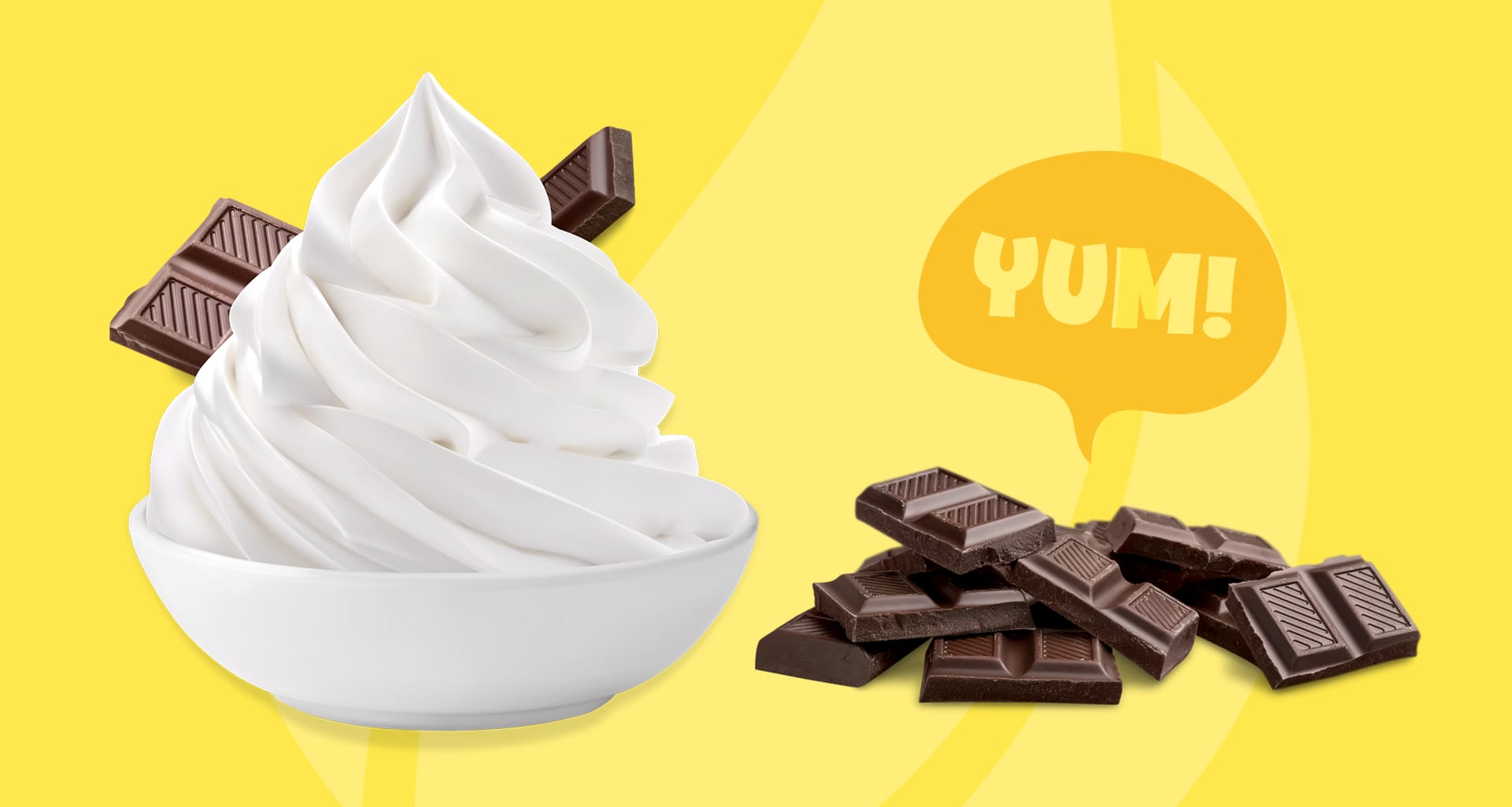
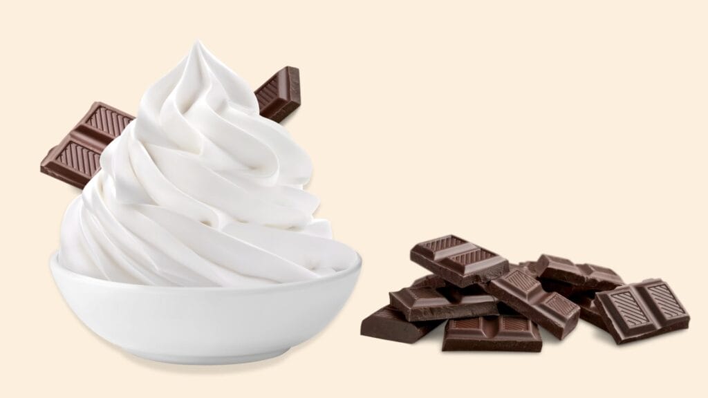
However, the actual promotion was for a new topping, not a new frozen yoghurt flavour. Whittaker’s Creamy Caramel and Coconut chocolate blocks were added to Yo-Chi’s topping bar, available nationwide as a special partnership promotion, with an official announcement at The Chocolate Fair launch event.
While the word “topping” was included in the caption, it wasn’t front and centre. The bold visual of the Frozen yoghurt dispensing machine, paired with subtle placement of the actual offering in the copy, led to confusion. Many customers believed they’d be able to pour Whittaker’s-flavoured froyo from the machines, only to find that wasn’t the case.
To their credit, Yo-Chi posted a clarification soon after. But by then, disappointment had already spread across social media, with fans expressing their frustration that the visuals didn’t match what was in store.
Maybe Yo-Chi and Whittaker’s will deliver a Whittaker’s chocolate frozen yoghurt flavour in the future? Here’s hopping!
The Takeaway: Clear Communication = Happy Customers
At Ignite Search, we see this as a learning moment, not a failure. Brand collaborations are exciting. They push creativity. But they also come with the challenge of aligning teams, visuals, copy and customer expectations.
Here’s what this case can teach us:
1. Visuals Must Match Reality
Clear marketing visuals matter because your imagery is the first—and often only—thing customers see. If it suggests something that isn’t available, even unintentionally, that gap can lead to disappointment. If it’s a topping, show the topping clearly. If it’s a new flavour, make that the hero.
2. Headlines Matter More Than Ever
Most users don’t read full captions. They skim. If your core offering is buried in line four of a caption, it risks being missed. Make the key message loud and proud! E.g., “New Topping!” or “Limited-Edition Add-On” in the headline, not the footnote.
3. Collaboration Requires Clear Alignment
When working with partners, make sure both teams are on the same page about the product, the customer journey, and the campaign message. Better yet, bring in a third-party strategist to help pressure-test the campaign before it goes live.

Final Thoughts On The Campaign and Digital Marketing
We’re fans of both Yo-Chi and Whittaker’s, and we respect the excitement they brought to this campaign. But even great brands can run into clarity issues when the creative unexpectedly leads the message instead of supporting it.
In the end, your customers just want to know what they’re getting. Give them clear, bold visuals and upfront messaging and they’ll reward you with loyalty and enthusiasm.
Need help pressure-testing your next big campaign?
Let’s chat. Ignite Search is here to help ensure your marketing is as clear as your ambition.
When in doubt, we’re here to help.
Ignite clarity. Ignite engagement. Ignite success. Let’s Ignite Your Potential.