Your landing page is often the first real handshake between your business and a potential customer. You don’t get many second chances on a landing page. Visitors decide in seconds if you’re relevant, credible, and easy to act on. You’ve paid for their click from a digital ad, now the page has to convince them to take the next step. That’s where smart design and strategic thinking can turn interest into action.
At Ignite Search, we focus on creating landing pages that do more than just “look good.” They’re built to convert. Here are the most important principles to keep in mind, straight from our own playbook.
1. Make the Most of Above-the-Fold Space
The part of your landing page people see without scrolling is your prime real estate.
This area should clearly state what you do and why it’s worth their time and what they should do next (a.k.a a big obvious button). Give them an easy action to take. Keep text short, one short paragraph or a few bullet points and make sure your call-to-action (CTA) button stands out visually.
Use images or short videos that instantly show the benefit of your product or service. And remember, on mobile devices, the action button should appear right away without needing to scroll.
TL;DR: The Conversion Formula
Clarity × Relevance × Trust ÷ Friction = Conversions
Everything below either increases clarity/relevance/trust or reduces friction. Design from that lens.
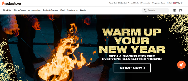
Example: Solo Stove uses a clean layout, clear benefits, and a prominent “Start Now” CTA that cuts straight to the point
2. Keep the Emotional Hook Up Front
Visitors often decide in seconds if they want to stay. Make the opening message speak to their needs, frustrations, or goals. If you can show that you understand their problem and have the solution, they’re far more likely to keep reading and click through. Lead with the “felt” problem: cost, time, uncertainty, missed growth. Then promise a believable path to relief. A good strategy to apply is replacing adjectives with outcomes: “Cut acquisition costs by 22% on average.”
Speak directly to the visitor’s problem or desire. If they feel understood, they stay.
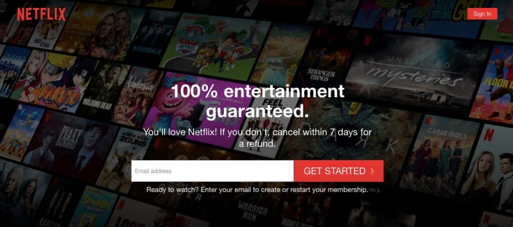
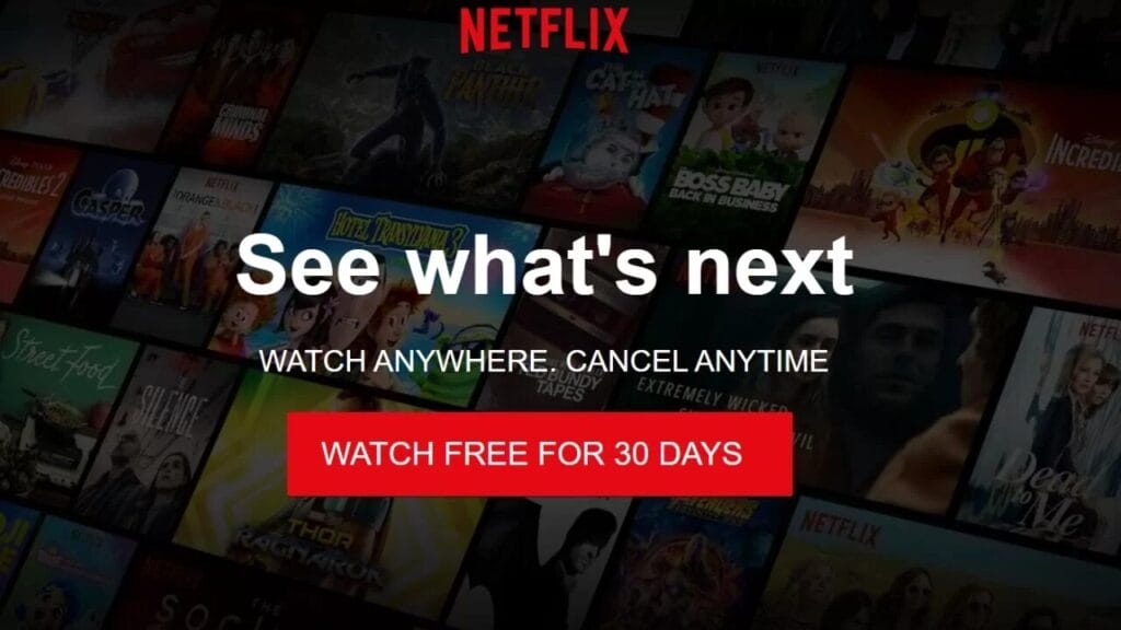
Example: While not Aussie, brands like Netflix and Dropbox use emotionally resonant headlines (“Anytime, anywhere” / “Simplify teamwork”) that connect instantly
3. Clear, Repeated Calls-to-Action
Don’t make them hunt for the button, People need multiple opportunities to act as they gain confidence. Keep navigation minimal to avoid distractions. Your page should have a clear goal, whether that’s booking a call, requesting a quote, or signing up. When it comes to the CTA button, designers often stick to the rule of 3 principle, place the CTA at the top, repeat it in the middle, and again at the bottom. This way, no matter where they are on the page, they can take action without hunting for the button.
Vary your CTA button language so accommodate every visitors needs, E.g., “Get my plan”, “Start my free audit”, “See my potential ROI”. If your CTA involves completing a survey or taking a test, you can reduce the risk of their not clicking by adding micro-copy underneath the button, “Takes 30 seconds”, “encrypted data security”, “No credit card”, “No obligation”
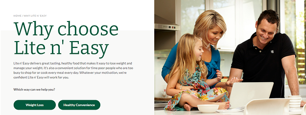
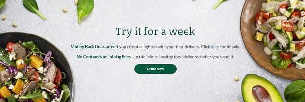
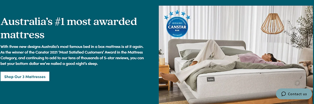
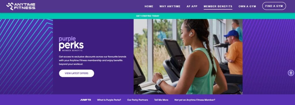
Example: On local-focused landing pages, Australian firms like Lite n’ Easy or Koala strip back menus on landing pages to spotlight the CTA and optimise with dual CTA’s when the landing page accommodates more than one customer persona.
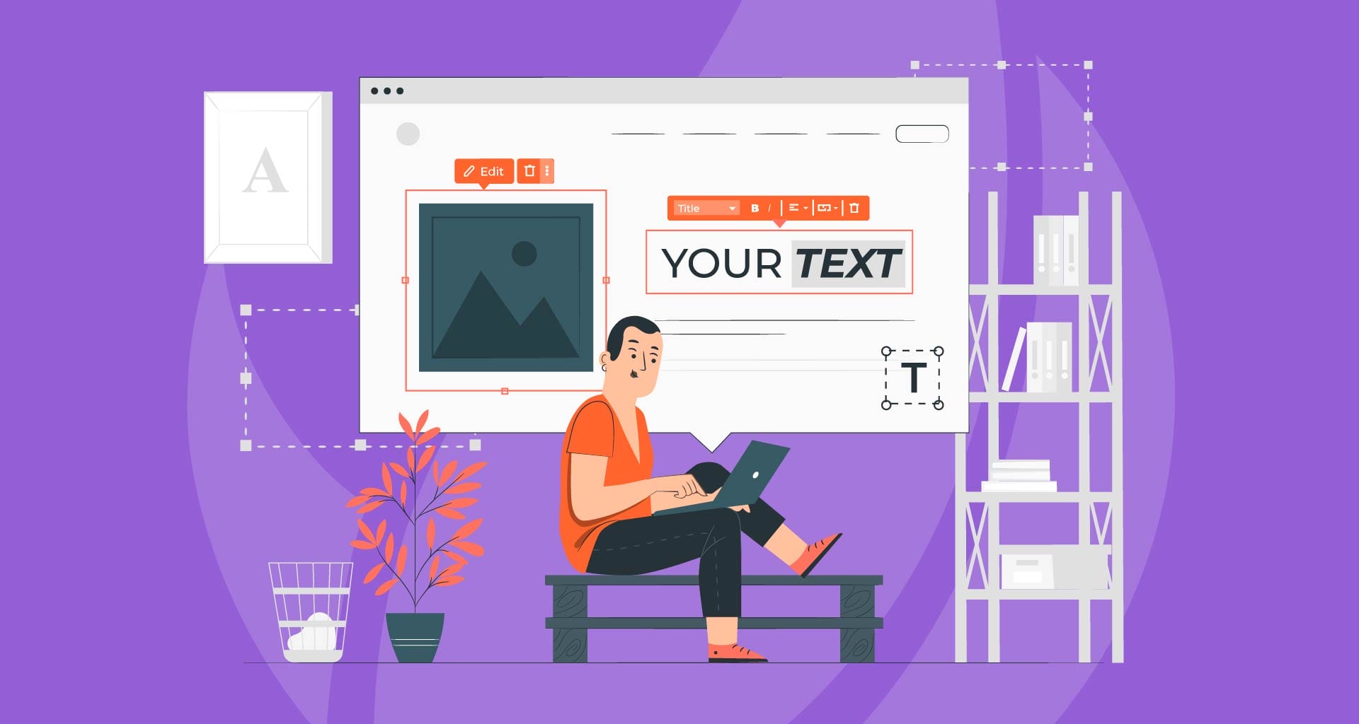
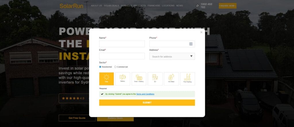
4. Forms That Feel Easy
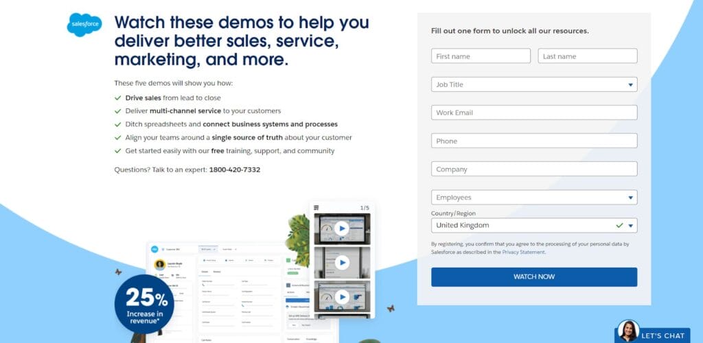
Every field is friction. Ask only what you truly need now. Forms are often where leads drop off. Keep them short and simple, only ask for the essentials at first. The easier it is to fill out, the more likely someone will do it. Place one form near the top for quick action and another at the bottom for people who want more information before committing. A best practice to lower the risk of non submissions is to add two form versions, with a short form at the top and a longer version at the bottom. Making sure that only the essential information is required fields to allow you to contact them in multiple ways and making all other information optional.
If you are finding you are receiving spam submissions on your form, you can opt to install a reCAPTCHA, a check box requirement to confirm completion.
Top Form Friction busters:
- Autofill + appropriate keyboards (numeric for phone)
- Clear privacy note and link near the submit button
- Trust signals above or below the form. E.g, “We’ll never spam you”
- Thank-you page with next steps (and a secondary goal: book a call, download asset)
Australian service operators often pair a brief “Get a Quote”, “Enquire Now” or “Download Now” forms for subscriptions, applications and more near the top with a more detailed option at the bottom for serious browsers.
5. Use Social Proof and Testimonials
People trust other people. Adding customer reviews, star ratings, client logos, or case studies gives visitors reassurance that others have had a positive experience. Position these close to your CTAs so they see them right before deciding. Add testimonials, star ratings, or logos close to your CTAs.
social proofs can be as simple as adding a line ““Join 1,200+ growing brands”, or including Client logos, industry awards, star ratings, case study snippets to your CTA.
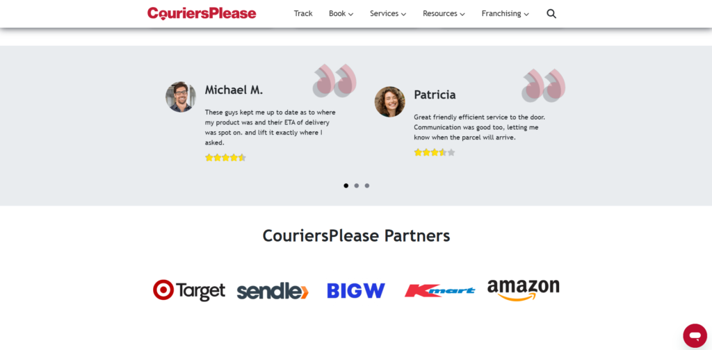
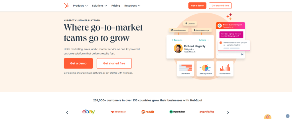
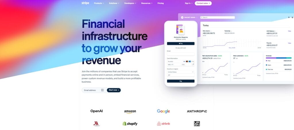
Example: Businesses like HubSpot, Stripe and CouriersPlease display customer logos to quickly boost credibility.
6. Minimise Distractions
This is not your homepage. A landing page should be focused. Remove competing elements (sliders, carousels) and unnecessary navigation menus, unrelated links, and any clutter that pulls attention away from your main offer. Every element on the page should guide the visitor towards your goal.
Pro Tips: Proper labels, hit-area sizes, focus states, and descriptive alt text (helps SEO, too). For long pages, sticky sub-nav that jumps to sections—but always keep a persistent CTA visible. Use a high-contrast colour combination to emphasise your CTA button and lift it from the websites background colour, e.g purple/orange, blue/yellow, green/red, orange/black, pink/blue or Red/cyan.
A common approach is to remove nav bars entirely so visitors are focused and experience tunnel vision.

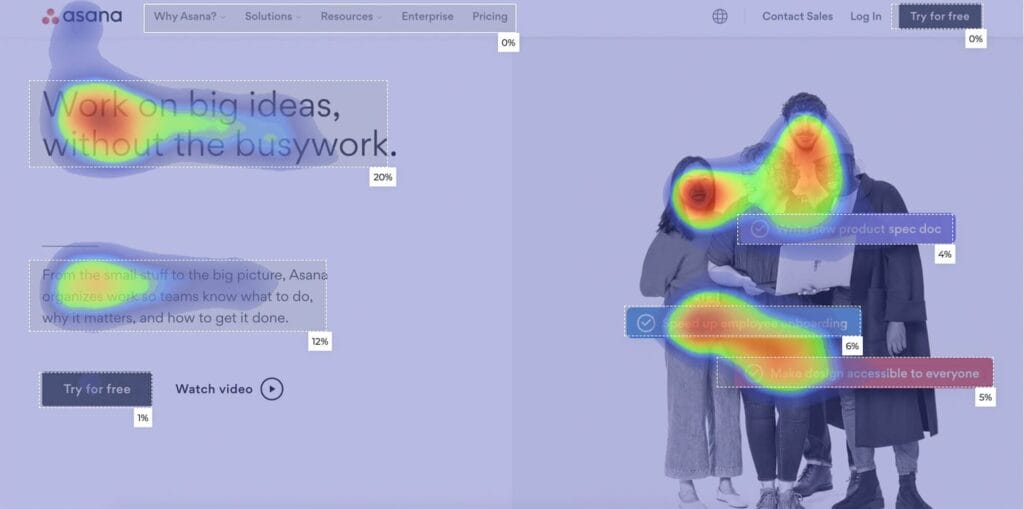
7. Track What Works (and What Doesn’t)
If it can be clicked, it can be learned from.
If you’re serious about conversions, you need to know what’s working. Tracking every click, scroll, and form submission helps you understand how visitors are behaving. Heatmaps and visitor journey tools show exactly where people lose interest or get stuck, information you can use to improve the page. Even simple tools like heatmaps can show if people ignore your hero CTA or form
See what’s really happening:
- Who clicks where (buttons, links, icons and images)
- Where people drop off (tracked page visits vs completed submissions)
- What copy/buttons work best (Call-to-action button names)
- What is their reaction like (rage clicking and yo-yoing)
Pro Tips: Use thank-you page and event-based conversions to catch both redirect and AJAX submissions. Enforce a standard naming convention, and pass UTMs into CRM so you can close the loop.
Tools like Hotjar, Google Analytics, Miro, Smaply and Slickplan are very useful for mapping out how effective your landing page is and where visitors are stopping before they click the needed button. The action needed can be unique to every user and sometimes it can be a matter of not knowing it was actually a button, the CTA not being where they expected it to be or thinking something was clickable when it wasn’t. All these are entirely fixable and give you a better idea of what your target audience comes to expect from their point of view.
8. Test and Refine
Small changes can make a big difference. Testing different headlines, button text, images, or even colours can reveal what resonates most with your audience. Ongoing improvements are key to higher conversion rates.
9. When Landing Pages Connect to Your Digital Ads
Keep the journey seamless. A dedicated landing page is the second half of your ad spend. The ad sets the expectation; the landing page has to deliver—fast. If you’re running Google, Meta, LinkedIn, or any other ads, your landing page should feel like a natural continuation of the ad.
That means:
- The headline should match the promise in the ad.
- The visuals and tone should feel familiar to avoid confusion.
- The offer should be exactly what they clicked for—no surprises.
Consistency builds trust and keeps people moving toward your CTA. This is where having dedicated landing pages for different campaigns can really pay off.
10. Speed and Mobile Experience Matter
Ads cost you for every click, so a slow load is like burning cash. Long load times or tricky mobile layouts cost conversions. If your page takes too long to load, people leave. If it’s hard to read or click on a mobile screen, they leave. Every second counts, fast, mobile-friendly pages keep visitors engaged and ready to act. Optimise hero images, minimise render-blocking scripts, and pre-connect to ad platforms for tracking pixels so they don’t delay the content.
Pro Tips: If your ad promotes a “Free 7-day trial”, your hero CTA shouldn’t say “Book a sales call”, it should offer that exact trial. Avoid bait-and-switch tactics; they kill trust and spike bounce rates. Ideally, each ad set or keyword theme should have its own landing page to maximise relevance.
Let Ignite Search Optimise Your Landing Page
Every click from an ad costs you money. If your landing page isn’t converting well, you’re paying for traffic that goes nowhere. A well-designed page means more leads for the same ad spend and better return on your marketing investment.
While these strategies give you the big picture, getting them right requires skill, testing, and the right tools. That’s what we do.
We’ll design or optimise your landing page so it’s:
- Clear and compelling
- Built for mobile
- Easy to act on
- Backed by data and proof
Whether you’re starting from scratch or improving an existing page, we’ll help turn your ad clicks into real leads.
Ready to increase your conversions?
Contact Ignite Search today and let’s make every click count.